
For 2,000 years, there was only one white pigment in European painting: lead white. It was made by placing lead strips above vinegar in clay pots, sealing them in rooms filled with horse manure (which provided heat and carbon dioxide), and waiting weeks for the lead to corrode into a white crust. The crust was scraped off, ground, and washed. The result was basic lead carbonate, 2PbCO3·Pb(OH)2, a thick, opaque, brilliant white that was the most widely produced white pigment in the world from antiquity to the 19th century. It was also toxic. Lead white caused lead poisoning in painters who handled it, in women who used it as cosmetics (it was one of the most popular ingredients used in cosmetics for skin whitening), and in children who lived in houses painted with it. The pigment that gave Renaissance paintings their luminous highlights and Baroque draperies their crisp whites was also a slow-acting poison.
White is the color of purity, emptiness, and modernism. In Renaissance painting, it was the color of light: the highlights on a face, the foam on a wave, the edges of a cloud. In modernism, it became the subject itself. Malevich's "White on White" (1918), Rauschenberg's "White Paintings" (1951), Ryman's all-white canvases (1960s through the 2000s). In architecture, Le Corbusier made white the color of modernism: clean, rational, stripped of ornament. The history of white is the history of art's relationship to light, to emptiness, and to toxicity. This guide covers lead white from antiquity to the 19th century, the invention of zinc white (1834) and titanium white (1918), Malevich and the white square, Rauschenberg and the blank canvas, Robert Ryman and the all-white painting, and what white means in art in 2026. For the companion piece, read our guide to the history of blue.
Lead White: The Only White for 2,000 Years
Lead white is basic lead carbonate, 2PbCO3·Pb(OH)2. It has been made since antiquity using the "stack" or "Dutch" process. Lead strips are suspended above vinegar in clay pots, sealed in rooms with fermenting matter (horse manure, waste grape skins, tanbark) that provides heat, carbon dioxide, and moisture. The acetic acid vapors convert the lead to lead acetate, which is then decomposed by carbon dioxide to form basic lead carbonate. The process takes 3 to 8 weeks. Theophrastus described it in the 4th century BCE. Pliny mentioned it. The Chinese used it by 300 BCE. The Dutch perfected the stack method in the 17th century, and the Netherlands became the center of lead white production in Europe. England granted a monopoly for lead white production in 1622.
The qualities of lead white are unmatched. It is thick, opaque, fast-drying in oil, and brilliant. It has a luminosity that no other white can match. Mondrian reportedly preferred it to titanium white, despite titanium's availability. According to the Natural Pigments historical account of stack-process white lead, it was "the sole white pigment used in European easel painting" until the 19th century. Every white highlight in every Renaissance and Baroque painting you have ever seen is lead white. There was no alternative.
The toxicity is the price. Lead white causes lead poisoning, a condition that damages the nervous system, kidneys, and reproductive system. Painters who handled lead white, especially those who licked their brushes to point them, were at risk. Women who used lead white as cosmetics suffered what contemporaries called "the fatal danger" of lead poisoning. By the early 20th century, lead white was banned for interior painting in most countries under the Geneva White Lead Convention (1905-1930). Its presence in paintings dropped from 100% in the early 20th century to 10% by 1945, and it nearly disappeared after WWII. A 2018 study in Heritage Science on the white of the 20th century documents this transition in detail. For more on how oil paint works and why the choice of white matters for layering, see our guide to oil painting techniques.
Zinc White (1834) and Titanium White (1918)
Zinc white (zinc oxide, ZnO) was marketed by Winsor & Newton in 1834. It was less toxic than lead white but had drawbacks. It was more than four times as expensive, had less hiding power (it was more transparent), and dried to a brittle film that cracked over time. It only became popular after 1850, when the price dropped.
Titanium white (titanium dioxide, TiO2) is the "whitest white" or "absolute white." It was first patented in 1910 by the Norwegian chemist Peder Farup and industrialist Gustav Jebsen. Industrial production began in November 1918 in Fredrikstad, Norway. Titanium white is non-toxic, brilliant, opaque, and resistant to discoloration. It revolutionized the color industry. By the mid-20th century, it had replaced lead white in almost all applications.
Mondrian used "Permalba" (a titanium white brand) for "Broadway Boogie Woogie" (1942-1943), though he complained about its properties and is assumed to have preferred lead white. The white that Le Corbusier used on his modernist buildings was toxic lead white, not the pure, clean white that modernism claimed. The "whitest white" (titanium) was not available until 1918, and it took decades to replace lead white entirely.
Here is the point I want to make: titanium white democratized white. It made white safe, affordable, and stable. But it also changed the character of white in painting. Lead white has a warmth and luminosity that titanium white lacks. Titanium is brighter, flatter, colder. The whites of old master paintings (lead) and the whites of modern paintings (titanium) are different colors. The difference is material, not just aesthetic. When you look at a Vermeer and a Mondrian side by side, the whites do not match. They cannot match. They are made of different substances. For the basics of how color works, see our guide to color theory.
Malevich and the White Square (1918)
Kazimir Malevich (1879-1935) was a Russian avant-garde artist. "Suprematist Composition: White on White" (1918), 79.4 x 79.4 cm, now at MoMA, was painted the year after the October Revolution. The painting is a white square painted on a slightly different white background. The two whites are not the same. One is warm, one is cool. The difference is barely visible, but it is the entire content of the painting. The work is a reduction of painting to its minimum. Not a picture of something, not an expression of something, but paint on a surface. Malevich called it "a desperate struggle to free art from the ballast of the objective world."
The context matters. Malevich had painted "Black Square" in 1915, 79.5 x 79.5 cm, now at the Tretyakov Gallery. A black square on a white ground, hung in the icon corner of the exhibition room. "White on White" is the sequel. If "Black Square" was the end of representation, "White on White" was the end of color. After this, painting could go no further. The white square is the last painting, or the first.
"White on White" made white the subject of painting. White was no longer the background, the highlight, the negative space. It was the content. This was a radical move. It said that painting does not need figures, narratives, or even color contrast. It needs only paint and a surface. White became the color of the avant-garde, the color of reduction, purity, and the end of art. For more on where this kind of reduction leads, see our guide to Minimalism.
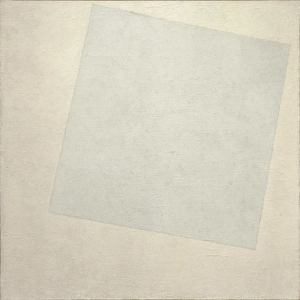
Kazimir Malevich, "Suprematist Composition: White on White" (1918). Oil on canvas, 79.4 x 79.4 cm. Museum of Modern Art, New York. Image via Wikimedia Commons
Rauschenberg and the Blank Canvas (1951)
Robert Rauschenberg (1925-2008) made "White Paintings" in 1951. Seven panels, house paint on canvas, 72 x 72 in. Rauschenberg said the paintings were "hypersensitive." They registered the light, shadow, and dust in the room, functioning as "airports for the lights, shadows, and particles." The context was Abstract Expressionism: Pollock's drips, de Kooning's slashes, Rothko's color fields. In that context, a blank white canvas was a provocation. John Cage said the paintings were "screens of light" that reflected the viewer and the room back to itself. They were not empty. They were full of everything that happened around them.
Rauschenberg's white paintings asked a question that has not been answered: what is a painting? Is it the paint on the canvas, or the space around it? Is it the artist's gesture, or the viewer's perception? The white canvas is the limit case, the painting that has been reduced to nothing and is still a painting. It influenced Cage's "4'33"" (1952), the silent piece of music that is "full of" the sounds of the room. For more on how this kind of provocation fits into the current scene, see our guide to contemporary art trends in 2026.

Robert Rauschenberg, "White Painting" (1951). House paint on canvas, 72 x 72 in. Collection of the artist's estate. Image via Wikimedia Commons
Robert Ryman and the All-White Painting (1960s-2000s)
Robert Ryman (1930-2019) painted only white for 50 years. Not white as a subject (like Malevich) or as a provocation (like Rauschenberg) but as a material. Ryman's paintings are about the paint itself: its consistency, its application, its support, its edge. He used different whites (lead white, titanium white, zinc white), different supports (canvas, paper, aluminum, fiberglass), different application methods (brush, palette knife, roller), and different edge treatments (taped, wrapped, exposed). The paintings look "all white" but are in fact complex explorations of surface, texture, and edge. "There is never a question of what to paint," Ryman said, "but only how to paint."
Ryman's work shows that white is not one color but many. The white of lead paint is different from the white of titanium paint, which is different from the white of zinc paint. The white of a smooth surface is different from the white of a textured one. Ryman's paintings are a catalog of whites, a demonstration that the most "empty" color is in fact the most variable. If you want to understand how looking at this kind of work works, read our guide to how to look at art for beginners, and for more on the reduction tradition, see our guide to Minimalism.
White as Modernism's Color
Le Corbusier made white the color of the new architecture: clean, rational, stripped of ornament. The Villa Savoye (1929-1931) is white. The Five Points of Architecture (1927) are articulated through white surfaces. But the white paint Le Corbusier used was toxic lead white, not the pure, clean white that modernism claimed. The "Homeric cleaning up" of architecture that Le Corbusier attributed to Adolf Loos was, materially, a cleaning up with poison.
Mondrian used white as a structural element. The white grid in "Composition with Red, Blue and Yellow" (1930) is not empty space but an active component of the composition. White, for Mondrian, was not the absence of color but a color in itself, equal to red, blue, and yellow. The Wikipedia article on lead white documents the transition from lead to titanium in detail, including Mondrian's preferences.
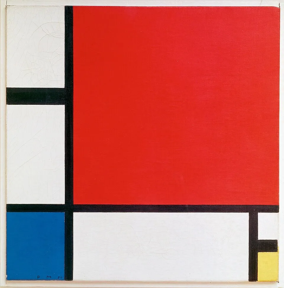
Piet Mondrian, "Composition with Red, Blue and Yellow" (1930). Oil on canvas, 46 x 46 cm. Kunsthaus Zürich. Image via Wikimedia Commons
The paradox of modernist white is this. Modernism's white was supposed to be pure: free of history, free of ornament, free of meaning. But white is the most loaded color in art. It is the color of lead poisoning, of colonial "purity," of racial categories, of emptiness and absence. Modernism's claim that white was neutral was itself a historical construction, a claim made by specific people at a specific time for specific reasons. The claim that white is "pure" or "empty" is not a fact. It is an assertion. For the long view of how these claims fit into art history, see the art movements timeline.
White in 2026
White is still the default color of galleries. The "white cube" strips art of context and presents it as autonomous. This modernist inheritance is increasingly questioned. Galleries are experimenting with colored walls, textured surfaces, and contextual displays that challenge the neutrality of white. The white gallery wall is not natural. It is a choice, and it is a choice that dates to the 1920s and 1930s.
Titanium white is now the standard: non-toxic, affordable, ubiquitous. But some painters still use lead white, despite its toxicity, because of its unique qualities. The debate between lead and titanium is a debate about whether beauty justifies danger. It is the same debate that surrounds cochineal (colonialism) and chrome yellow (lead poisoning). The material is never neutral.
White still means purity, emptiness, and modernism. But it also means privilege, exclusion, and erasure. The "white cube" gallery has been critiqued as a space that excludes non-Western art, art by women, and art that does not conform to modernist aesthetics. The history of white in art is not just a history of pigment but a history of power. For more on where the gallery system is heading, see our guide to contemporary art trends in 2026.
Final Thoughts
White was the most dangerous color in art for 2,000 years. Lead white, the only white pigment from antiquity to the 19th century, was a brilliant, opaque, fast-drying pigment that also caused lead poisoning. Zinc white (1834) and titanium white (1918) provided safer alternatives, but at a cost: titanium white is colder and flatter than lead white. In modernism, white became the subject of painting. Malevich's "White on White" (1918) reduced painting to its minimum. Rauschenberg's "White Paintings" (1951) made the blank canvas a mirror. Ryman's all-white paintings (1960s through the 2000s) showed that white is not one color but many.
Next time you see an all-white painting in a gallery, do not dismiss it as empty. Look closer. The white may be lead (warm, luminous) or titanium (cold, flat). The surface may be smooth or textured. The edges may be taped or exposed. The painting is not "nothing." It is a specific material, applied in a specific way, by a specific person. The white is a choice, not an absence.


