
In 1775, the Swedish chemist Carl Wilhelm Scheele invented a brilliant green pigment, copper arsenite, that became known as Scheele's green. It was the brightest green anyone had ever seen, and it was immediately popular for wallpaper, textiles, paints, and even children's toys. It was also laced with arsenic. When the wallpaper got damp, as it often did in unheated Victorian rooms, the arsenic was released as a toxic vapor. Children died. Factory workers were poisoned. The Lancet, founded by Thomas Wakley (who "narrowly escaped death by the green décor of the offices' walls"), campaigned for a ban. William Morris, the great Victorian designer and socialist, dismissed the concerns: "as to the arsenic scare a greater folly is hardly possible to imagine: the doctors were bitten as people bitten by witch fever." Morris's early wallpapers, including "Trellis" (1864), contained arsenic green. His father owned the largest arsenic mine in the country. The beauty of green, in the Victorian era, was inseparable from its toxicity.
Green is the color of nature, of growth, of envy, and of poison. In the Renaissance, it was the color of spring (Botticelli's "Primavera") and of money (the green of banknotes, originally printed with green ink to deter counterfeiting). In the 19th century, it was the color of arsenic: Scheele's green (1775), Paris green (1814), and emerald green (1814) all contained arsenic. In the 20th century, it was the color of viridian, a stable, non-toxic green that finally gave painters a safe alternative. This guide covers the history of green in art: verdigris and the old masters, Scheele's green and the arsenic wallpaper scandal, Paris green and emerald green, William Morris and the Victorian design industry, viridian and the Impressionists, and what green means in art in 2026. For the companion piece, read our guide to the history of blue.
Verdigris: The Green of the Old Masters
Verdigris (copper acetate) was the standard green pigment in European painting from antiquity to the 19th century. It was made by exposing copper plates to vinegar (acetic acid), the same process that produces the green patina on bronze statues. The pigment is a transparent, bright blue-green, ideal for glazing.
Verdigris was used by Veronese, El Greco, and the Venetian school. Veronese's "The Wedding at Cana" (1563), 677 x 994 cm, at the Louvre, uses verdigris for the green robes. The pigment's transparency made it ideal for layering over gold leaf or underlayers. The green has a luminosity that opaque greens cannot match.
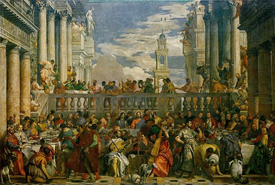
Paolo Veronese, "The Wedding at Cana" (1563). Oil on canvas, 677 x 994 cm. Louvre, Paris. Image via Wikimedia Commons
The problem is that verdigris is unstable. It reacts with sulfur compounds in the atmosphere and turns brown. Many old master paintings that now show brown or dark areas were originally green. The verdigris has degraded. The green of the old masters is often a ghost, a color that has disappeared. The green that Veronese painted in 1563 may now be brown. This is a recurring theme in pigment history: the colors we see in museums are not always the colors the painters intended. For more on this problem, see our guide to famous paintings and what they are about.
Scheele's Green: The Arsenic Scandal (1775)
Scheele's green (copper arsenite, CuHAsO3) was invented by Carl Wilhelm Scheele in 1775. It was the first bright, vivid green pigment. Previous greens (verdigris, green earth, malachite) were muted or unstable. Scheele's green was, according to a 2024 study in npj Heritage Science on Scheele's and emerald green, "rapidly welcomed by artists due to its unique vibrant hue."
The use was widespread. Scheele's green was used in wallpaper, textiles, paints, calico printing, window blinds, house and ship painting, wax stoppers for wine bottles, paper dye, and even sweets and children's toys. It was included in the catalogues of F. W. Devoe, Frost and Adams, Lefranc, Richard Aine, and Bourgeois Aine. It was never sold by Winsor & Newton, the one major manufacturer that refused to carry it.
The danger is that Scheele's green contains arsenic. When the pigment gets damp, as it does in unheated, poorly ventilated rooms, the arsenic is released as arsine gas (AsH3) or dimethyl arsinic acid. The German chemist Leopold Gmelin noted in 1839 that damp rooms with green wallpaper "often possessed a mouse-like odour," the smell of arsenic compounds. Children died. Henry Letheby, a public health officer, investigated the deaths of children in a bedroom papered with green wallpaper and found "three grains per square foot of arsenic," a lethal dose.
The Lancet campaigned for a ban. Mrs. Beeton's household manual warned against "Brilliant (emerald) green which had a pernicious influence on the health." A test was published in The Times: carry a phial of ammonia and drop it on suspicious green fabric. If it turns blue, the fabric contains arsenic. Industrialists dismissed the concerns. Some "offered to eat pounds of their paper in order to silence opposition."
Scheele's green is the most dangerous pigment in art history. It was not a pigment used by great painters (it was too unstable for fine art). It was a pigment used in domestic interiors, in wallpaper, in clothing, in toys. It killed ordinary people, not artists. The scandal was not about art but about the chemical industry's willingness to poison the public for profit. For more on how art and design intersect with social harm, see our guide to art and society.
Paris Green and Emerald Green (1814)
Paris green (copper acetoarsenite, Cu(C2H3O2)2·3Cu(AsO2)2) was invented in 1814 by Wilhelm Sattler and Friedrich Russ in Schweinfurt, Germany. It was also known as Schweinfurt green, Mitis green, Sattler green, Vienna green, emperor green, and mountain green. It was a brighter, more durable version of Scheele's green.
Paris green was used in paintings (the Impressionists, Monet, Renoir, Cézanne used it), wallpaper, textiles, and, starting in 1867, as the world's first chemical insecticide. It was used on crops, in vineyards, and against the Colorado potato beetle. It was also used as a rodenticide. The Wikipedia article on Paris green documents the full range of uses and the toxicity data.
Paris green is "extremely toxic," more so than Scheele's green. Factory workers in pigment production facilities were exposed to "hazardous airborne arsenic compounds, leading to frequent cases of both acute and chronic poisoning." It was one of the most dangerous industrial pigments of the era. In paintings, Paris green "produces a rich, dark green with an undertone of blue." The pigment "can degrade quickly" in paintings. Some Impressionist greens have darkened or browned. The green that Monet painted may not be the green we see today.
By the late 19th century, arsenic greens were being phased out. Public awareness, the availability of less toxic alternatives (chromium and cobalt greens), and the sheer number of poisoning cases led to a decline. Scheele's green was available in manufacturers' catalogues until 1898, 120 years after its discovery, but its use was declining. For the basics of how these colors work, see our guide to color theory.
William Morris and the Arsenic Wallpaper
William Morris (1834-1896) was a Victorian designer, socialist, and founder of the Arts and Crafts movement. Morris & Co. produced wallpapers, textiles, and furniture from 1861. The arsenic connection is direct. Morris's father, William Morris Sr., owned Devon Great Consols (DGC), the largest copper and arsenic mine in England. DGC's income "funded the establishment of Morris and Co." Morris's early wallpapers, including "Trellis" (1864), his first commercially sold pattern, contained arsenic green pigments. Arsenic has been found in several of Morris's early designs produced between 1864 and 1875.
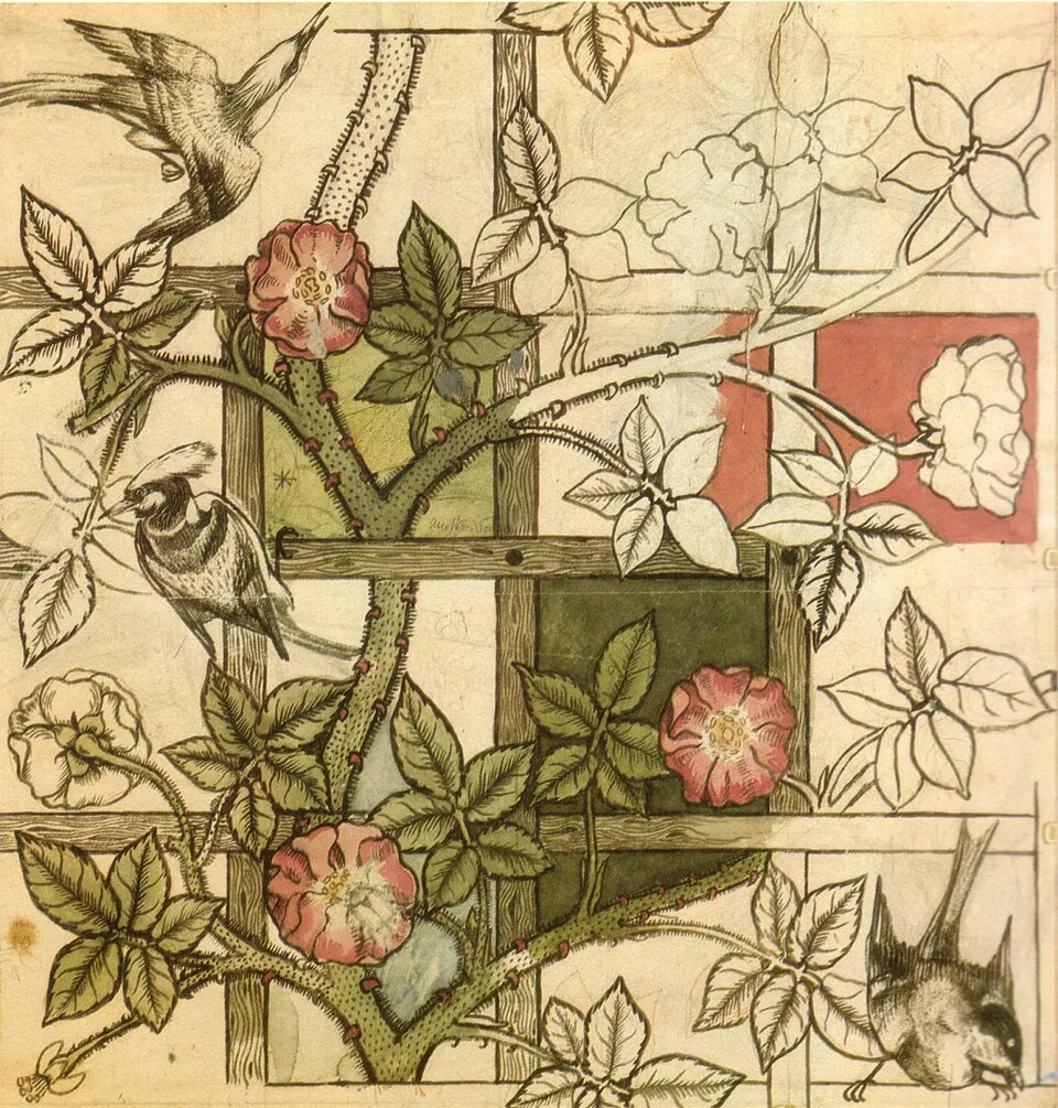
William Morris, "Trellis" wallpaper pattern (1864). Green pigment containing arsenic. Victoria and Albert Museum, London. Image via Wikimedia Commons
Morris dismissed the arsenic scare: "as to the arsenic scare a greater folly is hardly possible to imagine: the doctors were bitten as people bitten by witch fever." His disbelief has been questioned. DGC was the largest arsenic producer at the time, and Morris owned shares in the company. His dismissal of the health risks may have been motivated by financial interest. Due to public concern, Morris & Co. was forced to find alternatives. The company printed a disclaimer on the cover of their stand book (now in the V&A): "Free From Arsenic." The V&A's blog on arsenic-free wallpapers documents this transition. But the disclaimer came only after years of producing arsenic-laced wallpapers.
Here is the contradiction I want to be honest about. Morris is the great Victorian designer, the man who championed handcraft, beauty, and social justice. He was also a man who used arsenic green in his wallpapers, owned shares in an arsenic mine, and dismissed the health risks to the public. The contradiction is not unique to Morris. It is the contradiction of the Victorian design industry, which produced beautiful objects using toxic materials and exploited the workers who made them. The beauty and the poison are not separate. They are the same system.
Napoleon and the Green Wallpaper Myth
Napoleon Bonaparte died in exile on St. Helena on May 5, 1821. The cause of death was officially stomach cancer. But a persistent rumor claimed that Napoleon was poisoned by arsenic in the green wallpaper of his room at Longwood House. The story was based on the discovery of arsenic-containing green wallpaper in the Drawing Room at Longwood, and on analysis of Napoleon's hair, which showed elevated arsenic levels.
In 2007, an international team of researchers applied modern medical techniques to analyze the writings of Napoleon's doctors, his family's medical records, and eyewitness reports. They found nothing to indicate arsenic poisoning, such as hemorrhaging inside the heart. What they did find was strong evidence of gastric cancer: rapid weight loss, a stomach filled with a grainy substance indicative of gastrointestinal bleeding, and a large lesion on the stomach. The arsenic wallpaper theory was finally disproved. Napoleon most likely died of stomach cancer.
But the wallpaper was real. There was arsenic-containing wallpaper in Longwood. The wallpaper "was unlikely to have done much to improve Napoleon's health," but it did not kill him. The myth of Napoleon's green wallpaper death is the cultural memory of a real public health crisis. Arsenic green wallpaper was everywhere in the 19th century, from Buckingham Palace (Queen Victoria ordered every room stripped of green wallpaper after the investigation) to the bedrooms of children who died. For more on famous works and their stories, see our guide to famous paintings and what they are about.
Viridian: The Safe Green (1838)
Viridian (hydrated chromium oxide, Cr2O3·H2O) was invented in 1838 by the French chemist Pannetier and commercialized by the French pigment manufacturer Guignet in 1859. It is a deep, transparent, stable, non-toxic green. It was the first safe green pigment.
Viridian was adopted by the Impressionists and Post-Impressionists: Monet, Cézanne, Van Gogh, Seurat. Monet's water lilies and garden paintings use viridian. Van Gogh's "Field with Irises near Arles" (1888) uses viridian alongside emerald green. The pigment's transparency and stability made it ideal for the layering techniques of Impressionism.
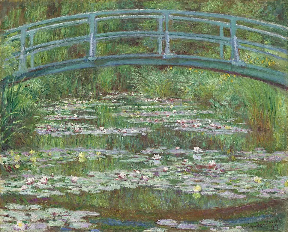
Claude Monet, "The Japanese Bridge" (1899). Oil on canvas, 81.3 x 101.6 cm. Metropolitan Museum of Art. Image via Wikimedia Commons
Viridian is the green that finally gave painters a safe, stable alternative to arsenic greens. It is the green of modern painting, the green that Monet and Van Gogh used, the green that is still in every paint box today. The history of green is the history of a color that was beautiful and deadly for 100 years (1775 to 1859) and then, finally, safe. For more on how these pigments work in layering, see our guide to oil painting techniques.
Green in 2026
The arsenic green scandal is not just history. It is a cautionary tale about the chemical industry's willingness to poison the public for profit. The same dynamics, corporate denial, regulatory delay, public health consequences, are visible in contemporary debates about PFAS ("forever chemicals"), microplastics, and other industrial toxins. The green wallpaper is the Victorian version of a problem that is still with us.
The Poison Book Project, an interdisciplinary research initiative at Winterthur Museum, Garden & Library and the University of Delaware, has been identifying arsenic-containing books in library collections since 2019. The project focuses on 19th-century publishers' bindings colored with emerald green (copper acetoarsenite) bookcloth. As of July 5, 2026, the project's Arsenical Books Database lists 488 emerald green bindings identified to date, representing 411 unique imprints. Several libraries, including the British Library and German libraries, have restricted public access to these books and now handle them with gloves and respirators. The project held a webinar on June 10, 2026, on safe handling practices. The green books on library shelves are the direct descendants of the green wallpaper on Victorian walls.
Green still means what it has always meant: nature, growth, envy, and poison. The green of a spring meadow, the green of a banknote, the green of a poison label. All carry the weight of pigment history. Green is the color that is most associated with nature and most associated with toxicity. This contradiction is not accidental. It is structural. The most beautiful greens were the most dangerous, and the safe greens (viridian) arrived only after a century of poisoning. For more on where art is heading, see our guide to contemporary art trends in 2026, and for the long view, the art movements timeline puts the whole story in sequence.
Final Thoughts
Green is the color of nature and of poison. Verdigris (copper acetate) was the green of the old masters: brilliant, transparent, and unstable. Scheele's green (1775) was the first bright green, and it was laced with arsenic. Paris green (1814) was brighter and more durable, and more toxic. William Morris used arsenic green in his wallpapers and dismissed the health risks while owning shares in an arsenic mine. Napoleon's green wallpaper death is a myth, but the arsenic wallpaper crisis was real. Children died, factories poisoned workers, and the industry denied everything. Viridian (1838) finally gave painters a safe green.
Next time you see a Victorian green wallpaper in a museum, or a 19th-century book with an emerald green cover, know that the green may contain arsenic. Museums and libraries now handle these objects with gloves and respirators. The beauty of the color is real, but so is the poison. Green is the color that teaches us that beauty and danger are not opposites. They are often the same thing.


