
"Always aim for eye level. In the gallery world, we rely on the '57-inch rule.' This means the very centre of your artwork (not the top of the frame!) should sit exactly 57 inches (about 145 cm) from the floor," according to About Wall Art. The 57-inch rule comes from museum and gallery practices. It is the average human eye level, and it is the single most important principle in hanging art. Get the height right, and everything else follows. Get it wrong, and "art sits too close to the ceiling, it floats away from the furniture and the people living in the room." The second principle is scale. "Artwork should measure approximately two-thirds to three-quarters the width of the furniture it sits above. That ratio creates visual balance without overwhelming the room or disappearing into it," according to Frame the World. A 72-inch sofa needs art around 48 inches wide. A tiny frame above a massive sofa looks lost. A massive canvas in a small bedroom overwhelms. The third principle is connection. "Keep the artwork width at about 60-75% of the furniture below, and position the bottom edge roughly 6-10 inches above the surface," according to Eleanos Gallery. Art should feel anchored to the furniture, not floating independently.
Decorating with art is not the same as collecting art. Collecting is about what you buy. Decorating is about where you put it. The same painting can look remarkable in one room and lost in another. The difference is placement, scale, and context. This guide covers how to decorate with art, room by room, including the golden rules, the living room, the bedroom, the kitchen, the hallway, the bathroom, the home office, gallery walls, and common mistakes to avoid. For more on working with limited wall space, see our guide to art for small spaces.
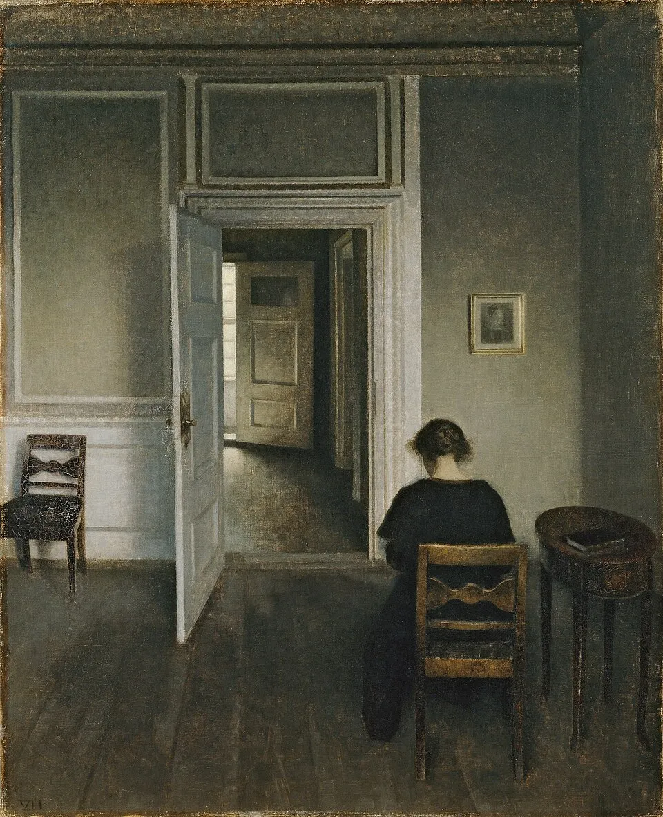
Vilhelm Hammershøi, "Interior, No. 30 Strandgade" (1906). Oil on canvas, 71 x 57.5 cm. ARoS Aarhus Kunstmuseum. Hammershøi's interiors demonstrate the power of a single, well-placed artwork. Image via Wikimedia Commons
The Golden Rules: Height, Scale, and Connection
The 57-inch rule: "57-60 inches (145-152 cm) from the floor is the standard eye level, meaning the center of your artwork, or the visual center of a gallery wall, should fall within this range. This guideline comes directly from museum and gallery practices" (Eleanos Gallery). Measure from the floor to the center of the artwork, not the top of the frame. This is the most common mistake people make. They measure to the top of the frame, hang the art too high, and the piece floats toward the ceiling.
The scale rule: "Artwork should measure approximately two-thirds to three-quarters the width of the furniture it sits above" (Frame the World). For a 72-inch sofa, art should be 48 to 54 inches wide. For a 60-inch headboard, art should be 40 to 45 inches wide. The connection rule: "6-10 inches (15-25 cm) is the recommended distance between the bottom of your artwork and the top of the furniture below it. This creates a clear visual relationship without crowding" (Eleanos Gallery). Eight inches is the sweet spot. The spacing rule: "2-3 inches (5-8 cm) is the ideal spacing between frames in a grouped arrangement. Anything tighter tends to feel cramped, while wider gaps can make pieces feel disconnected" (Eleanos Gallery). The wall rule: for walls without furniture, such as hallways and stairwells, "the artwork should occupy about 50-70% of the available wall width, with the center positioned around standard eye level" (Eleanos Gallery).
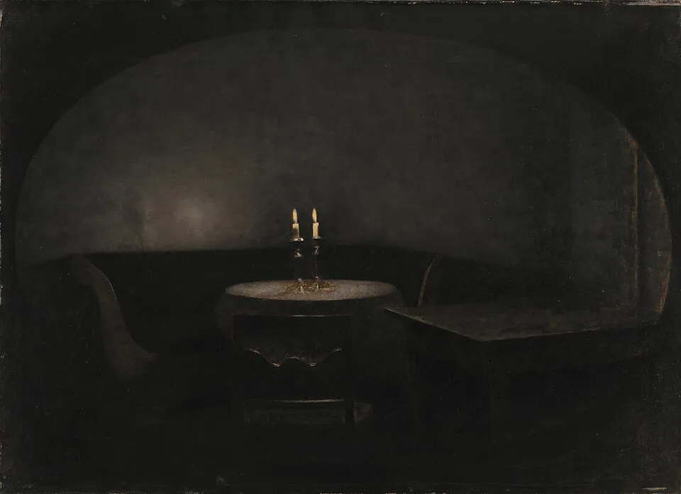
Vilhelm Hammershøi, "Interior. Artificial Light" (1909). Oil on canvas. Statens Museum for Kunst, Copenhagen. The relationship between art, furniture, and lighting is the foundation of decorating with art. Image via Wikimedia Commons
The Living Room: Anchor Above the Sofa
"Make the art width about two-thirds of your sofa width. A 72-inch sofa needs art around 48 inches wide. Leave a gap of 6 to 10 inches between the top of the sofa back and the bottom of the frame. Eight inches is the sweet spot. Center the whole composition at 57 to 60 inches from the floor" (Eleanos Gallery). For layout options: "A single large piece is the safest and most elegant choice. If you love your sofa and don't want competition, this is your answer. For longer sofas (over 80 inches), try three matching pieces in a horizontal row or a triptych. Avoid busy gallery walls above seating, they compete" (Eleanos Gallery).
On color: "Pulling accent colours from room textiles, cushions, or trim creates balance without making the space feel flat. A painting that picks up the rust tone in your throw cushions ties the room together far more elegantly than a piece chosen to match the wall paint" (Frame the World). The 2026 trend for living rooms is "Oversized Statement Art, One large focal piece," according to The Walls Art. "Homes in Switzerland and Austria often [use] neutral tones with one bold artwork [as a] focal point." For more on building a collection, see our guide to starting an art collection.
The Bedroom: Art That Supports Rest
"Art above the headboard should not exceed the width of the bed frame" (Frame the World). "Above the bed, select a horizontal piece or a pair of vertical canvases to balance the space. Remember, scale comes into play here as well, aim for filling roughly two-thirds the width of the headboard," according to Katie Phillips Art. On mood: "Bedrooms require calm and emotional softness. Soft pastel art, nature-inspired prints, minimal line drawings, abstract calming visuals. Blue and green tones reduce stress and improve sleep quality" (The Walls Art). "Your bedroom should feel like a retreat, and your artwork can help create that sense of calm. Look for soft palettes, peaceful landscapes, abstracts with flowing movement, art that feels soothing rather than stimulating" (Katie Phillips Art).
What to avoid: bold, confrontational, or chaotic art. The bedroom is for rest. The art should support rest, not disrupt it. For more on the connection between art and wellbeing, see our guide to art therapy.
The Kitchen: Small Spaces with Big Personality
"Small originals tucked onto a shelf, styled on the counter near a coffee bar, or hung above a pantry door can instantly elevate the space" (Katie Phillips Art). The kitchen is not a gallery. It is a workspace. Art in the kitchen should be small, playful, and unobtrusive. Good options: "Small florals, mini abstracts, playful still lifes (think food or drinks), pieces with cheerful or warm color palettes" (Katie Phillips Art). "Typography prints (Eat, Enjoy, Gather), food illustrations, small framed sets, vintage culinary art" (The Walls Art).
What to avoid: "Avoid anything too delicate or valuable in high-traffic areas" (Katie Phillips Art). The kitchen has steam, grease, and splashes. Use sealed frames, avoid unsealed charcoal or delicate paper. For more on how art reflects daily life, see our guide to art and society.
The Hallway: Linear and Vertical
"Vertical pieces or a linear row of smaller works at eye level (roughly 145-150 cm to the centre of the piece)" (Frame the World). Hallways are narrow. Art should not protrude more than 2 inches from the wall. "A horizontal row is one of the most reliable layouts, especially above sofas, beds, or in long hallways. Aligning pieces in a straight line emphasizes width and creates a clean, balanced look" (Eleanos Gallery). "If a room feels narrow, a horizontal arrangement along the longest wall can visually expand the space. Aligning multiple pieces in a row helps guide the eye across the room" (Eleanos Gallery).
"A grid layout creates structure and order. Using identical frames and consistent spacing, it's ideal for hallways, offices, or modern interiors where a clean, organized look matters" (Eleanos Gallery). For more on tight spaces, see our guide to art for small spaces.
The Bathroom: Small but Mighty
"Smaller works in sealed frames, positioned away from direct shower spray" (Frame the World). "Bathrooms might not seem like a natural spot for artwork, but don't neglect these spaces. Think about it, you've got a captive audience, so why not have a little fun?" (Katie Phillips Art). Good options: "Lighthearted subjects, bright florals, smaller framed pieces. Consider figures or nudes for the master bathroom" (Katie Phillips Art).
What to avoid: "Make sure the artwork can handle moisture. Avoid unsealed charcoal or delicate paper pieces unless they are framed" (Katie Phillips Art). Use sealed frames with moisture-resistant backing. For more on tight spaces, see our guide to art for small spaces.
The Home Office: Motivation at Eye Level
"A single motivating piece at eye level when seated, not standing" (Frame the World). The home office is where you work. The art should motivate, not distract. Hang art at seated eye level, not standing eye level. The 57-inch rule applies to standing viewers. In a home office, adjust to seated eye level, approximately 48 to 52 inches from the floor to the center of the artwork. The 2026 trend for home offices is "Digital Printable Art, Affordable modern decor" (The Walls Art). Printable art is cheap, interchangeable, and perfect for a space where you want to change the art without changing the frames. For more on approaching art, see our guide to how to look at art.
Gallery Walls: How to Hang Art in Creative Groups
"A gallery wall is more flexible and expressive. It suits larger walls and mixed artwork. Start with a central anchor piece, then build outward while keeping spacing consistent. As Justina Blakeney describes it, the result should feel varied but cohesive, like a skyline" (Eleanos Gallery). Use 2 to 3 inch spacing between frames. "Even numbers of pieces tend to work best for gallery arrangements, creating symmetry that reads as intentional rather than accidental" (Frame the World).
The 2026 update: "Yes, but in a more refined form. Instead of cluttered frames, modern gallery walls now focus on symmetry, spacing, and consistent color themes" (The Walls Art). Where to use: large living room walls, stairwells, hallways. Where not to use: above the sofa, where they compete, in the bedroom, too busy for rest, in the bathroom, too much moisture for multiple frames. For more on small-space gallery walls, see our guide to art for small spaces.
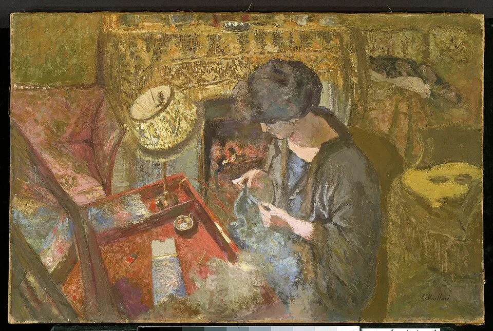
Édouard Vuillard, "The Small Drawing-Room: Mme Hessel at Her Sewing Table" (1917). Oil and gum tempera on paper, 50.8 x 76.2 cm. Metropolitan Museum of Art. Vuillard's interiors show art as part of daily life, not separate from it. Image via Wikimedia Commons
Common Mistakes to Avoid
Hanging art too high: "We have a natural, surprisingly common tendency to hang our frames much too high. When art sits too close to the ceiling, it floats away from the furniture and the people living in the room" (About Wall Art). The fix: measure 57 inches from the floor to the center of the artwork. Using too many small frames: "A single small print on a large wall looks lost. Grouping smaller artworks into gallery walls compensates for their individual size and creates cohesive visual impact" (Frame the World). "For small pieces: always group them together (a gallery wall or a diptych/triptych). Never let a single small piece float alone in a large area of blank wall" (Eleanos Gallery).
Ignoring lighting: "Poor placement can ruin design balance. Use LED backlighting for premium effect" (The Walls Art). Art that is not lit is art that is not seen. Consider picture lights, track lighting, or natural light placement. Mixing conflicting styles: "Stick to one theme per room" (The Walls Art). A Renaissance oil next to a neon pop art print in the same room creates visual confusion, not eclecticism. Choosing random colors without theme: "Your wall art must harmonize with furniture tones" (The Walls Art). "In a neutral room, one bold piece creates a focal point without visual noise. In a colourful room, art with a restrained palette provides breathing space" (Frame the World). For more on getting started, see our guide to art for beginners.
Final Thoughts
Three golden rules govern decorating with art: the 57-inch rule ("the very centre of your artwork should sit exactly 57 inches from the floor," from museum and gallery practices), the scale rule ("artwork should measure approximately two-thirds to three-quarters the width of the furniture it sits above"), and the connection rule ("6-10 inches between the bottom of your artwork and the top of the furniture below it"). Room by room: living room ("make the art width about two-thirds of your sofa width... a single large piece is the safest and most elegant choice"), bedroom ("art above the headboard should not exceed the width of the bed frame... blue and green tones reduce stress and improve sleep quality"), kitchen ("small originals tucked onto a shelf... avoid anything too delicate or valuable in high-traffic areas"), hallway ("vertical pieces or a linear row of smaller works at eye level"), bathroom ("smaller works in sealed frames, positioned away from direct shower spray"), home office ("a single motivating piece at eye level when seated, not standing"). Gallery walls: "start with a central anchor piece, then build outward while keeping spacing consistent," 2 to 3 inches between frames, even numbers for symmetry. Common mistakes: hanging art too high, using too many small frames, ignoring lighting, mixing conflicting styles, choosing random colors. The 2026 trends: "Oversized Statement Art," "Nordic Neutral Palette," "Digital Printable Art," and gallery walls "in a more refined form... focus on symmetry, spacing, and consistent color themes."
Measure your wall. Measure your furniture. Calculate two-thirds of the furniture width. That is your art width. Measure 57 inches from the floor. That is your center height. Measure 8 inches above the furniture. That is your bottom edge. Hang the art. Step back. Does it feel anchored? Does it feel connected? Does it feel right? If yes, you are done. If no, adjust. The 57-inch rule and the two-thirds rule are guidelines, not laws. The final judge is your eye. Trust it. For more gift ideas for art lovers, see our guide to art gifts.


