
"You might think that choosing tiny art for a small apartment is the only way to avoid a cluttered look, but the opposite is often true," according to First4Frames. The most common mistake in small spaces is going too small. A dozen tiny frames on a small wall creates clutter, not intimacy. One large painting, properly scaled and properly placed, does more than ten small ones. "One painting at the right scale, in the right spot, with enough empty wall around it, will do more for a compact room than a dozen small pieces scattered everywhere," according to ArtZolo. The principle is counterintuitive: in a small space, go big, but go big once. One statement piece, not a collection of miniatures.
The second principle: framing matters more in small spaces, not less. A thick, ornate frame eats visual space. The frame becomes the object, not the art. A thin, minimal frame lets the art breathe. The third principle: placement is everything. In a small space, every wall is a decision. The wall above the desk, the wall beside the bed, the wall visible from the front door, each one is an opportunity, and each one demands intention. "It's a common fear that a bold frame will make a room feel closed in or that awkward wall dimensions will forever limit your creative vision" (First4Frames). The fear is understandable. The solution is not to avoid art. It is to choose art that fits the space. This guide covers art for small spaces, including the one-large-piece principle, framing for small spaces, placement strategies, gallery walls in small spaces, the renter's guide, and what to avoid. For more on placement across room types, see our guide to how to decorate with art.
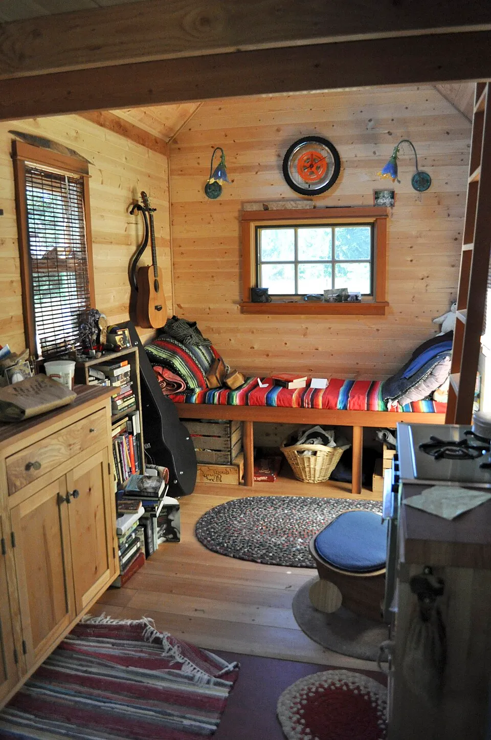
A tiny house interior in Portland, Oregon. In small spaces, every art decision matters more. "One painting at the right scale, in the right spot, with enough empty wall around it, will do more for a compact room than a dozen small pieces scattered everywhere" (ArtZolo). Image via Wikimedia Commons
The One-Large-Piece Principle
"You might think that choosing tiny art for a small apartment is the only way to avoid a cluttered look, but the opposite is often true" (First4Frames). One large piece, 24x36 inches or bigger, on a small wall creates a focal point. The eye is drawn to the art, not the size of the room. The room feels intentional, not cramped. The scale: in a small space, the art should occupy 50 to 70% of the available wall width. This is the same ratio used for furniture-less walls in larger spaces. But in a small space, the wall itself is smaller, so the art is smaller in absolute terms but larger in relative terms. A 30-inch-wide wall with a 20-inch-wide piece feels balanced. A 30-inch-wide wall with a 10-inch-wide piece feels lost.
"One painting at the right scale, in the right spot, with enough empty wall around it, will do more for a compact room than a dozen small pieces scattered everywhere" (ArtZolo). The empty wall around the art is part of the composition. It gives the art room to breathe and the eye room to rest. The exception: if the wall is truly tiny, under 24 inches wide, a single small piece (8x10 or smaller) is appropriate. But even then, frame it with intention and give it space. For more on placement, see our guide to how to decorate with art.
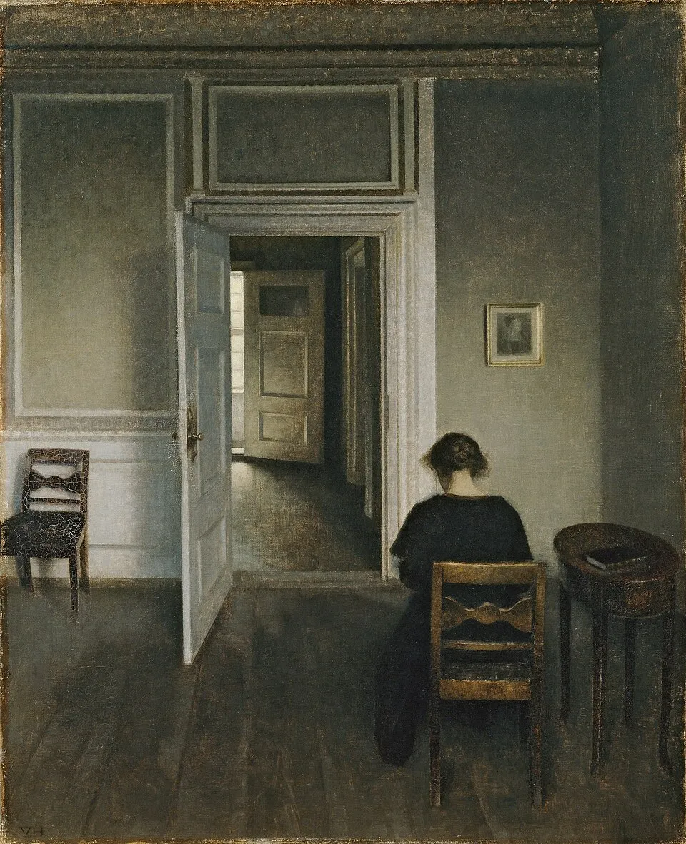
Vilhelm Hammershøi, "Interior, No. 30 Strandgade" (1906). Oil on canvas, 71 x 57.5 cm. ARoS Aarhus Kunstmuseum. Hammershøi's Copenhagen apartment paintings show how a single artwork defines a small space. Image via Wikimedia Commons
Framing for Small Spaces
Thin frames: "It's a common fear that a bold frame will make a room feel closed in" (First4Frames). The fear is justified. Thick frames eat visual space. Choose thin frames, 1/2 inch or thinner, in neutral colors such as black, white, or natural wood. The frame should be a boundary, not a feature. No frames (canvas wraps): a gallery-wrapped canvas, where the image extends around the edges, needs no frame at all. This eliminates the visual weight of the frame entirely, making the art feel lighter and the wall feel larger.
Floating frames: a floating frame, where the art appears to float inside the frame with a gap between the art and the frame, creates depth without bulk. The gap makes the art feel suspended, which adds visual interest without adding visual weight. Frame color: "Round frames soften sharp interiors and rectangular frames ground a space. A thin black metal frame reads differently from a wide gilded one" (Frame the World). In small spaces, thin black or white frames are the safest choice. They recede, letting the art dominate. What to avoid: thick ornate frames, wide matting (the mat adds visual bulk), dark heavy frames in dark rooms (they absorb light). For more on getting started, see our guide to art for beginners.
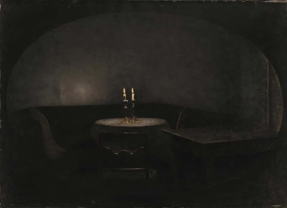
Vilhelm Hammershøi, "Interior. Artificial Light" (1909). Oil on canvas. Statens Museum for Kunst, Copenhagen. In small spaces, the frame is part of the art. Choose thin, minimal frames that do not eat visual space. Image via Wikimedia Commons
Placement Strategies: Leaning, Layering, and Vertical Use
Leaning: "The leaning approach offers a relaxed, flexible alternative. Resting art on the floor, a mantel, or a shelf works well for renters or anyone who likes to update their space often, adding a more casual, layered feel" (Eleanos Gallery). Leaning art against the wall, on a shelf, a mantel, a bookcase, eliminates the need for nails and creates a casual, layered look. In small spaces, leaning is often the best option because it avoids wall damage and allows for easy rearrangement.
Layering: lean a small piece in front of a larger piece. The layering creates depth and interest without requiring more wall space. This is a styling technique borrowed from interior designers. The art becomes part of a still life, not just a wall decoration. Vertical use: in small spaces, vertical space is the most underused resource. A tall, narrow piece, 16x20 or 20x24, draws the eye upward, making the ceiling feel higher and the room feel larger. Vertical art is the small-space dweller's secret weapon. The corner: corners are dead space in most rooms. A small piece of art placed in a corner, on a narrow shelf or a tiny wall, turns dead space into a moment. The corner does not need to be a gallery. One small piece is enough. For more on room-by-room placement, see our guide to how to decorate with art.
Gallery Walls in Small Spaces
"Hang up a mini gallery using smaller, complementary pieces to fill your wall space strategically. Choose three to five pieces that share a theme, like coastal art, or pick artworks with a shared color palette to maintain cohesion without overwhelming the room," according to iCanvas. A mini gallery, 3 to 5 small pieces, can work in a small space, but only if the pieces share a theme or color palette. Without cohesion, a small gallery wall becomes visual noise.
The layout: use a grid, identical frames, consistent spacing, rather than a scattered arrangement. "A grid layout creates structure and order. Using identical frames and consistent spacing, it's ideal for hallways, offices, or modern interiors where a clean, organized look matters" (Eleanos Gallery). In a small space, structure is essential. A scattered gallery wall feels chaotic in a large room and overwhelming in a small one. The spacing: 2 to 3 inches between frames, same as in large spaces. In small spaces, tighter spacing (1.5 to 2 inches) can work if the frames are identical. The tight spacing creates a unified block that reads as one piece, not many. The frame rule: identical frames only. Different frames in a small space create visual clutter. Same frame, same color, same size (or a consistent size ratio). The uniformity makes the gallery wall feel intentional, not accidental. For more on gallery walls across room types, see our guide to how to decorate with art.
The Renter's Guide: No-Drill Solutions
Command strips: the simplest no-drill solution. 3M Command strips hold up to 4 pounds per strip, enough for most framed prints. Follow the instructions: clean the wall, press firmly, wait an hour before hanging. Remove by pulling the tab slowly. The strip stretches and releases without damaging the wall. Leaning: as above, lean art on shelves, mantels, bookcases. No nails, no damage, no problem. Tension rods: a tension rod placed between two walls can hold a lightweight canvas. This works in narrow spaces, between bookshelves, in alcoves, in window frames.
Picture rails: if the apartment has picture rails (common in pre-war buildings), use picture rail hooks and wire to hang art without drilling. The hooks hold up to 50 pounds. Washi tape: for unframed prints or posters, washi tape (Japanese decorative tape) can hold lightweight paper to the wall without damage. The tape is low-tack and removes cleanly. This is not a permanent solution, but it is a renter-friendly one. The principle: renting does not mean living without art. It means hanging art differently. The no-drill solutions are not inferior to nails. They are different, and in some cases (Command strips for lightweight pieces, leaning for larger ones) they are better. For more on building a collection on a budget, see our guide to starting an art collection.
What to Avoid in Small Spaces
Too many small pieces: "A single small print on a large wall looks lost" (Frame the World). The reverse is also true: too many small prints on a small wall look cluttered. One large piece or a cohesive mini gallery. Nothing in between. Thick frames: thick frames eat visual space. In a small room, the frame should be a boundary, not a feature. Dark art in dark rooms: a dark painting in a dimly lit small room absorbs light and makes the room feel smaller. Choose art with light colors, or ensure the art is well-lit.
Art that is too big: the one-large-piece principle has limits. If the art is wider than the wall, it will not fit. If the art is taller than the ceiling, it will not fit. Measure before you buy. Ignoring the door: in small spaces, doors swing into the room. Art placed behind a door is art that gets damaged. Check the door swing before hanging. For more on approaching art, see our guide to how to look at art.
Final Thoughts
Art for small spaces follows three principles: go big once (one large piece, not many small ones, "the opposite is often true" when it comes to tiny art, "one painting at the right scale, in the right spot, with enough empty wall around it, will do more for a compact room than a dozen small pieces scattered everywhere"), frame thin (thin frames, no frames, or floating frames, "a bold frame will make a room feel closed in"), and place intentionally (leaning, layering, vertical use, corners). Gallery walls in small spaces work only with identical frames, consistent spacing (1.5 to 3 inches), and a shared theme or color palette, "three to five pieces that share a theme... to maintain cohesion without overwhelming the room." The renter's guide: Command strips (up to 4 pounds per strip), leaning (no nails, no damage), tension rods, picture rails, washi tape. What to avoid: too many small pieces, thick frames, dark art in dark rooms, art that is too big for the wall, art behind doors. The 2026 trends for small spaces: "Minimalist Abstract Art, Soft shapes, neutral tones" and "Nordic Neutral Palette, Beige, grey, white dominance" (The Walls Art). The principles are simple. The execution is everything. In a small space, every decision matters more, because every decision is visible. For more on what is current, see our guide to contemporary art trends.
Look at your small space. Find the largest wall, the one visible from the front door or from the bed. That is your statement wall. Measure it. Calculate 50 to 70% of the width. That is your art width. Buy one piece at that size. Frame it thin, black or white, 1/2 inch or thinner. Hang it at 57 inches to the center. Step back. The room just got bigger, not in square footage, but in intention. That is what art does in small spaces. It makes them feel chosen, not cramped. For more gift ideas, see our guide to art gifts, and for broader context, see our guide to art and society.


