
Most people walk into a museum feeling fine until someone near them starts talking about "the chiaroscuro in the corner" or "the broken impasto strokes." Then the enjoyment curdles into a vague, nagging sense of not knowing enough. Here is the truth about art vocabulary: you do not need most of it. But a small number of terms, maybe fifteen or twenty, genuinely change what you are able to see and describe. Once you have those, looking at a painting becomes less mysterious and more active.
This guide covers the terms that actually do that work: the ones that describe how paintings are made, how they are organized, and what they are trying to do. These are not definitions to memorize before an exam. They are tools for looking more precisely.
Medium: What the Work Is Made Of
Medium refers to the material an artist uses to make a work. This sounds like a technical footnote, but it directly shapes what you see. Oil paint behaves differently from watercolor, and both behave differently from fresco or encaustic. Knowing the medium tells you what was and was not possible when the work was made.
The most common painting media you will encounter in Western art history are these: oil paint (pigment suspended in linseed oil, which dries slowly, allowing for reworking and layering), tempera (pigment in egg yolk, which dries fast and cannot be blended easily, giving early Renaissance paintings their precise, jewel-like quality), watercolor (pigment in a water-soluble gum, transparent and immediate), and acrylic (a 20th-century synthetic medium that dries quickly, is highly flexible, and can mimic both oil and watercolor). Fresco is not paint at all, technically: pigment applied directly into wet plaster, where it bonds chemically as the wall dries. Michelangelo's Sistine Chapel ceiling is fresco. Once it sets, you cannot fix mistakes without replastering.
Sculpture media include bronze (cast from a wax model through a lost-wax process), marble (carved by subtraction, which means the finished form was always inside the block), and assemblage (constructed from found or manufactured objects). When you read that a sculpture is cast bronze, you know it was made through a multi-step process involving a mold and liquid metal. When you read it is carved marble, you know a block was removed material by material until the form emerged. These are not equivalent ways of working, and the difference shows in the finished object.
Composition: How the Work Is Organized
Composition is the arrangement of visual elements within a picture frame or sculptural space. It is the single most important structural decision a visual artist makes, and it is entirely invisible to most viewers because they are looking at the subject rather than the arrangement. Looking at composition means asking not "what is in this painting?" but "why are things placed where they are?"

The rule of thirds is one compositional framework: placing key elements at the intersections of an imaginary three-by-three grid creates more visual tension than centering them. But breaking this rule deliberately, as many painters do, creates a different kind of visual statement.
Key compositional concepts to recognize include balance (the distribution of visual weight across the image, which can be symmetrical or deliberately off-kilter), focal point (where the artist has directed your eye first, through contrast, placement, or detail), and negative space (the empty areas around and between subjects, which carry as much compositional weight as the filled areas). The full guide to composition in art covers these in much more depth, with specific painting examples.
Line, Shape, and Form
Line is the most basic element of visual art: a mark that indicates direction, boundary, or movement. In drawing and printmaking, line is often the primary means of describing form. In painting, line may be implied by the edge between two color areas rather than drawn explicitly. The character of a line, whether it is thin or thick, straight or curved, confident or hesitant, carries meaning independently of what it depicts.
Shape is two-dimensional: a flat area defined by line or color contrast. Form is three-dimensional, or the illusion of three dimensions on a flat surface. When a painter uses shading to make a circle look like a sphere, they are turning shape into form. This distinction matters because many of the most significant shifts in art history involve artists deliberately refusing to create the illusion of form, choosing instead to assert the flatness of the picture plane. Paul Cézanne's late paintings do this. Henri Matisse's cutouts make the flatness their entire subject. Understanding the difference between shape and form helps you see what these artists were actually doing.
Chiaroscuro and Tenebrism
Chiaroscuro is Italian for "light-dark." In painting, it refers to the use of strong contrast between areas of light and shadow to create the illusion of three-dimensional form. Leonardo da Vinci developed the technique systematically; Raphael used it with great refinement. But the painter who pushed chiaroscuro into something more extreme was Caravaggio.
Tenebrism, often attributed to Caravaggio and his followers, is an intensified version of chiaroscuro: figures emerging from absolute darkness, lit by a single concentrated light source. In Caravaggio's "Calling of Saint Matthew" (1599-1600, in the Contarelli Chapel, Rome), the figures in a tavern are painted with such concentrated shadow that the hand of light falling across them feels almost physical. You can see this technique directly in Artemisia Gentileschi's work and in Rembrandt's portraits, both of which developed the Caravaggesque approach in different directions. The Artemisia Gentileschi guide covers tenebrism as it appears in her "Judith Slaying Holofernes" in detail.
Impasto
Impasto refers to paint applied thickly enough that the brushstroke or palette knife mark remains physically visible, creating texture on the surface of the canvas. When you stand close to a Van Gogh painting in a museum, the surface is not flat. The paint rises from the canvas in ridges. In "The Starry Night" (1889), the night sky is built from thick, directional strokes of Prussian blue, cobalt, and white that create almost sculptural swirls. The movement of his hand across the canvas is preserved in the physical surface of the paint. In contrast, a painting by Jan Vermeer is almost entirely without impasto: the surface is smooth, the brushwork invisible, the paint so thin that it looks like it was breathed onto the panel rather than applied.
Impasto is not just a textural choice. It changes how light behaves on the surface of the painting, because thick paint casts small shadows at the edges of each stroke. This is one reason heavily impasto paintings look different in photographs than they do in person. A reproduction flattens the surface. The original has physical relief.
Perspective
Linear perspective is the mathematical system for representing three-dimensional space on a two-dimensional surface. Developed and codified by Filippo Brunelleschi in Florence around 1420, it works on the principle that parallel lines appear to converge at a single vanishing point on the horizon. Everything in the picture gets smaller in proportion to its distance from the viewer. Masaccio's "Trinity" fresco (c.1427, Santa Maria Novella, Florence) is one of the earliest surviving paintings to use fully systematic linear perspective. Contemporary observers reportedly thought it was a hole in the wall.
Atmospheric perspective is different: the observation that objects in the distance appear lighter in tone, cooler in color, and less sharply defined than objects in the foreground, due to the haze of atmosphere between the viewer and distant objects. Leonardo used atmospheric perspective with great subtlety. The backgrounds of his paintings seem to recede into blue-gray mist precisely because he understood and applied this principle. Neither technique is "more correct." They describe different aspects of how distance looks.
Symbolism and Iconography
Iconography refers to the symbolic content of an image: the specific objects, figures, colors, and gestures that carry conventional meanings within a particular artistic tradition. In European religious painting, a lily means purity and is associated with the Virgin Mary. A skull means mortality. A lamb means Christ. A peacock means eternal life. These meanings were not arbitrary: they were part of a shared visual language that educated viewers were expected to recognize.
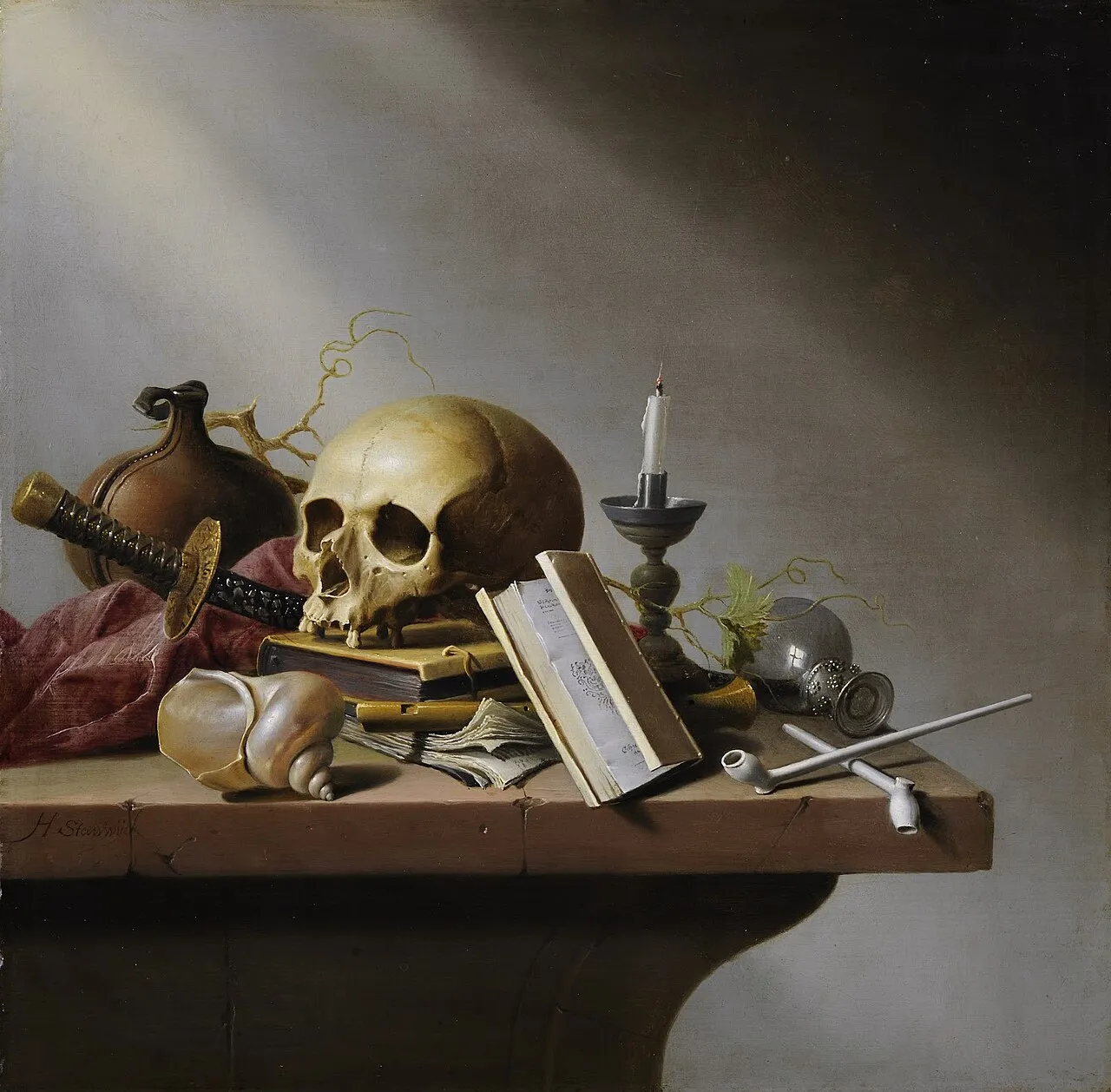
Harmen Steenwijck, "Vanitas Still Life" (c.1640). The skull, the hourglass, the extinguished candle, the rotting fruit: each object is a symbol in a visual argument about the brevity of life. Seventeenth-century Dutch viewers would have read this image the way we read a text. Image: Public domain, via Wikimedia Commons.
Vanitas paintings, popular in 17th-century Dutch art, are entire compositions built around symbols of mortality and the passage of time. The skill is in arranging beautiful objects that are also arguments: the hourglass runs out, the flowers wilt, the candle burns down. Understanding iconography transforms these from attractive still lifes into philosophical statements. The guide to reading a painting covers how to approach symbolic content systematically.
Style and Movement: The Big Labels
Art movements are categories that group artists who were working in related ways, often at the same time, in the same place, with shared ideas. The labels are useful, but they are also constructed after the fact: Caravaggio did not think of himself as a Baroque painter. He thought of himself as a painter. The "Baroque" category was applied retroactively to describe a set of characteristics that appeared across European art between roughly 1600 and 1750.
The terms you are most likely to encounter in museums: Realism (art that aims to show the world as it looks, without idealization), Impressionism (painting focused on light, color, and the fleeting moment rather than precise line and finish), Expressionism (art that distorts appearance to convey inner emotional states), Abstract (art that does not depict recognizable subjects), and Figurative (art that does depict recognizable subjects, especially the human figure). Contemporary means made roughly from the 1970s onward. Modern, confusingly, means roughly 1860 to 1970. For a full breakdown of all the major movements and what distinguishes them, the art history cheat sheet gives you the dates and key ideas for each.
Medium vs. Technique
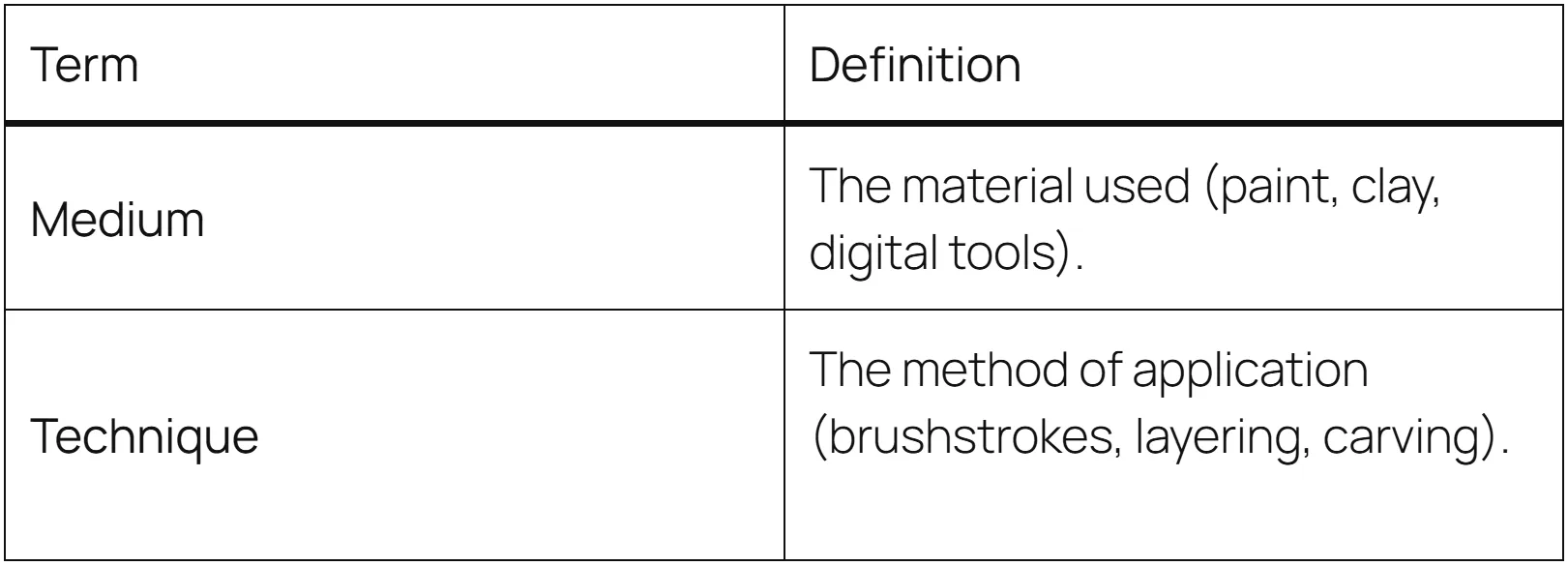
These two terms are often used interchangeably, but they refer to different things. Medium is what you work with (oil paint, watercolor, bronze). Technique is how you use it. Two painters working in oil can have completely different techniques: one might apply paint wet-on-wet in thick, gestural strokes; another might build up thin, transparent glazes over weeks, letting each layer dry completely before adding the next. Jan van Eyck's oil paintings and Jackson Pollock's oil paintings are made from the same basic medium but use techniques so different they are almost incomparable.
A Practical Note on How to Use These Terms
The point of art vocabulary is not to talk about art more impressively. It is to look at it more precisely. When you know what impasto is, you automatically look at the surface of a painting to see if the paint is thick or thin. When you know what chiaroscuro is, you start noticing where the light source is in every painting you look at. The vocabulary gives you questions to ask, and questions give you things to find.
Start with five terms from this list on your next museum visit. Pick the ones that seem most relevant to the work you are planning to see. If you are going to a Baroque exhibition, chiaroscuro and tenebrism will be immediately useful. If you are going to an Impressionist show, broken color, impasto, and the idea of painting en plein air will open up what you are looking at. For how to apply this vocabulary in front of a real painting, the step-by-step painting guide will walk you through the process. And for the historical context behind the movements these terms describe, see the complete guide to art movements. The more you look, the more specific your looking becomes.


