
There is a painting at the National Gallery in London called "The Supper at Emmaus" by Caravaggio, painted in 1601. It shows Christ revealing himself to two disciples at an inn, the moment of recognition captured at its exact peak. The disciple on the left is throwing his arms wide. The one on the right is gripping the table edge so hard his knuckles are white. The innkeeper standing behind Christ has no idea what he is witnessing. The whole thing is a study in the split second before understanding breaks open. I have stood in front of it for close to an hour across different visits, and it still gives me something new each time. Not because the painting changes, but because looking with intention always reveals more than looking by habit.
Most people spend less than thirty seconds in front of any painting in a museum. Not because they lack interest, but because no one ever taught them what to look for. Without a structure, the eye registers an impression and moves on. The painting has not been read. It has been glimpsed.
Reading a painting is a skill you can learn. This seven-step framework works on any painting, in any period, in any style. The steps move from immediate sensory response outward to historical and technical analysis, building a richer understanding of what you are looking at and why it was made. You do not need to complete all seven steps every time. For a quick gallery visit, the first four will already give you more than most visitors get in a full hour.
Step 1: First Contact — What Do You Actually See?
Before you do anything else, look at the painting without asking questions. Spend sixty seconds simply taking in what is there. This sounds obvious, but most people skip it entirely, moving immediately to the label to find out who made it and when. The label activates what you already know or think you know, and it shapes your perception before you have had a chance to form one independently.
During those sixty seconds, notice what catches your eye first. Where does your attention go? What is the largest element? The brightest? Is there a figure, an object, or a shape that immediately demands attention? Your initial response, even before you have any analytical vocabulary, is information. It tells you something about what the painter made prominent and how they guided the viewer's attention into the image.
After sixty seconds, ask yourself: what is the overall mood? Not what the painting means, but how it makes you feel right now. Calm, uneasy, joyful, melancholic, disoriented? That response is not arbitrary. It is produced by specific formal choices the painter made, and understanding which choices produced it is what the subsequent steps are for.
Step 2: Read the Subject — What Is Actually Happening?
Now describe what you see as literally as possible, ignoring any symbolic or interpretive reading for the moment. How many figures are there? What are they doing? Are they interacting? What objects are present? What is the setting, and what time of day does it appear to be?
This literal description sounds elementary, but it is surprisingly easy to skip in the rush to interpretation. Many viewers see "a religious painting" when what they are actually seeing is something specific: two men in a dimly lit room, one of whom is pointing at a pile of coins while the other looks up with an expression of surprise. That is Caravaggio's "The Calling of Saint Matthew" (1599-1600). Describing exactly what is happening, before naming the subject, forces you to look carefully rather than pattern-match to a known category.
For abstract paintings where there is no representational subject, describe the forms instead. Are they geometric or organic? Hard-edged or soft? What colors dominate? How large are they relative to the canvas? Are there clear focal points, or is the surface evenly distributed? This kind of description is itself a way of reading the work, even without interpretation. The foundational skills in our guide to how to look at art for beginners will help you build this vocabulary quickly.
Step 3: Analyze the Composition — How Is It Organized?
Composition is the arrangement of visual elements within the picture plane, and it is the primary structural tool painters use to control how you move through the image. Every compositional choice, where figures are placed, how large they are relative to each other, what angles the dominant lines follow, how the picture is divided into areas of light and dark, directs your attention and creates rhythm.
When reading the composition, ask yourself four things. Where is the focal point, and how did the painter achieve it (through size, placement, contrast, or detail)? What do the dominant lines do? Diagonal lines create movement and energy; horizontal lines create stability; vertical lines create height and formality; curves create flow. How is the picture balanced? Symmetrical compositions feel stable and formal, while asymmetrical ones feel more dynamic. And what is in the foreground, middle ground, and background? Does the painter create spatial depth, or deliberately flatten it?
The full guide to understanding composition in art covers these principles with specific examples across periods.
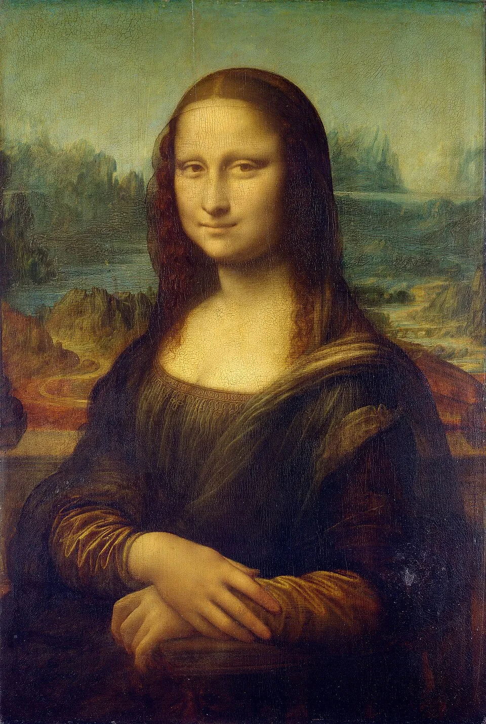
Leonardo da Vinci, "Mona Lisa" (c.1503-17), oil on poplar panel, 77 x 53 cm. Louvre, Paris. The pyramidal composition, the sfumato technique, and the impossible geological landscape are all formal choices worth analyzing separately. Image: Public domain, via Wikimedia Commons
Step 4: Read the Color and Light — What Are They Doing?
Color and light are among the most powerful tools in any painter's kit, and they work at both a formal and an emotional level. Formally, they create spatial depth (warm colors advance, cool colors recede), define objects, and organize the composition. Emotionally, they produce states and associations that operate directly on the viewer's nervous system, often before conscious analysis has time to catch up.
Ask yourself: what is the dominant color temperature? Warm paintings built from reds, oranges, and yellows feel active, intimate, sometimes threatening. Cool paintings built from blues, greens, and greys feel contemplative, distant, or melancholic. Are the colors harmonious, or do they create friction? Were they chosen to produce comfort or unease?
Light is equally structured. Where does it come from? How many sources are there? How sharp or gradual is the transition from light to shadow? Caravaggio's single concentrated light source against deep darkness creates drama and psychological intensity. Vermeer's diffused window light creates stillness and intimacy. Turner's dissolved light creates atmosphere and a sense of vast, open space. These are not accidental differences. They are expressive tools deployed with specific intentions. The guide to color theory for art appreciation explains the underlying principles in detail.
Step 5: Identify the Period and Movement — When Was This Made and Why?
Now you are ready to use external knowledge. What period does this painting belong to, and what were the dominant concerns of that period? A Baroque painting was made in a specific historical context: the Counter-Reformation, the Catholic Church's project of making religious imagery emotionally compelling, and the growing wealth of Dutch merchants who wanted portraits and domestic scenes. Understanding that context changes what you see in the painting.
A Realist painting of the 1850s is making a specific argument: that ordinary working people, factory workers, peasants, and the poor, are legitimate subjects for serious art, at a time when the academic tradition insisted on historical, mythological, and religious subjects only. A Cubist painting is solving a specific problem: how to represent three-dimensional reality on a two-dimensional surface more completely than the single-point perspective that Renaissance painters established as the correct method. Knowing the problem a painting is responding to makes the solution legible.
The complete guide to art movements is the reference to consult at this step. The individual movement guides go deeper into each period's specific concerns and historical pressures.
Step 6: Look at the Technique — How Was This Actually Made?
The physical surface of a painting carries meaning that purely formal or iconographic analysis misses. Is the paint applied in thick, textured impasto strokes that catch the light three-dimensionally? That is a different physical experience from the thin, smooth glazes of a Flemish old master, or the flat, evenly applied color of a hard-edge abstract painting. Each technique creates a different kind of presence and relates to the artist's specific intentions about what a painting should do to the person standing in front of it.
Look at the edges of forms. Are they defined by sharp contour lines, or does one area dissolve into another? Rembrandt's figures emerge from shadow with soft, undefined edges. Ingres' figures are bounded by precise, almost sculptural outlines. These are technical differences that correspond to entirely different philosophies of what a painting should be.
Look at the brushwork. Can you see individual strokes, or has the paint been blended to invisibility? Monet's visible broken strokes record the moment of looking. Bouguereau's invisible blended surfaces pursue an ideal of perfect finish. Van Gogh's urgent directional strokes carry emotional charge in a way that smooth painting never could. The guide to oil painting: glazing, impasto, and why it takes months to dry explains the technical basis of these differences.
Step 7: Put It All Together — What Is the Painting Saying?
Now bring everything together into a reading. This is not about finding the "correct" interpretation, which rarely exists in any simple sense. It is about forming a considered response that draws on what you have observed across the previous six steps. Subject, composition, color, light, historical context, and technique all interact to produce a specific effect and carry a specific range of meanings.
Some questions guide this synthesis: What is the most important relationship in this painting? Between figures? Between figure and setting? Between light and dark? Between the painting and the viewer? Does the painting create or resolve tension? Is the composition stable or dynamic, the colors harmonious or clashing? What does this painting require of the viewer: passive contemplation, active interpretation, emotional empathy, intellectual engagement?
Finally, return to your initial response from Step 1. Does your analysis explain why the painting made you feel what you felt at first sight? Sometimes it does. Sometimes the analytical reading reveals that your initial response missed something important. Both outcomes are worth having.
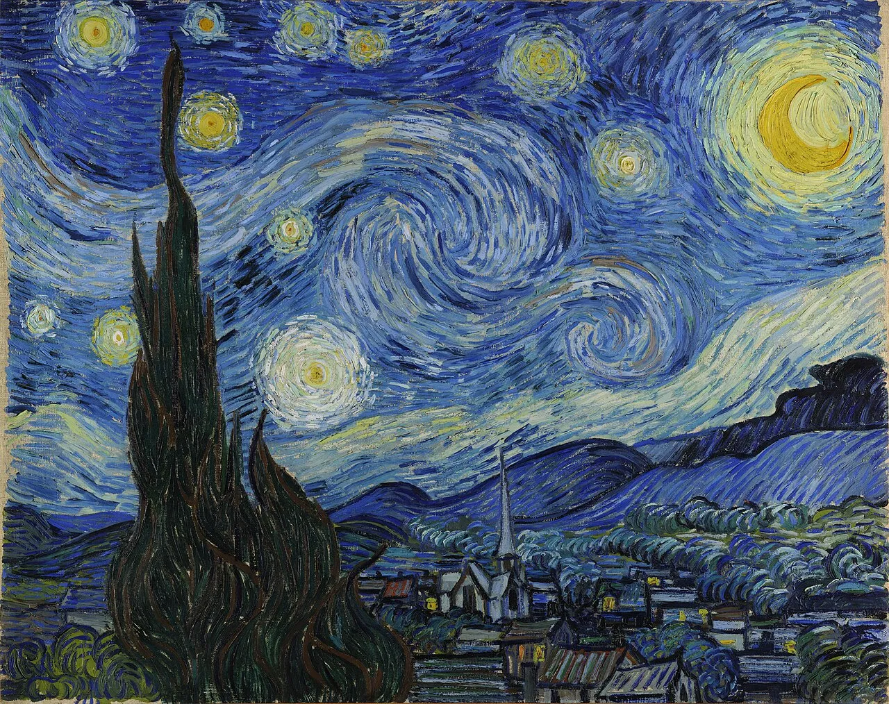
Vincent van Gogh, "The Starry Night" (1889), oil on canvas, 73.7 x 92.1 cm. Museum of Modern Art, New York. Apply all seven steps to this painting: read the composition, the brushwork, the color temperature, the historical context of Van Gogh's stay at Saint-Paul-de-Mausole in 1889, and notice what all of these together produce. Image: Public domain, via Wikimedia Commons
Practical Tips for Using This Framework
This framework works best when you slow down. Set a timer for five minutes when you stand in front of a painting you want to understand. Five minutes is a long time in a gallery, and most paintings will yield something new in that span if you work through even the first four steps. In practice, experienced museum visitors have internalized these questions through years of application, so the key observations happen quickly and almost unconsciously. The framework is scaffolding: useful while you are building the habit, invisible once it is built.
You do not need to go through all seven steps in sequence every time. Certain steps yield more for certain types of painting. Composition rewards attention in Renaissance and Baroque work. Color and light are the key to Impressionism. Historical context unlocks Conceptual Art. Technique is central to abstract painting. Developing a feel for which steps are most productive for which types of work is itself part of becoming a more confident looker.
The framework also works from reproductions, though much less well than from originals. Scale matters enormously. A Rothko color field painting that is three meters wide is a completely different physical and emotional experience from a reproduction on a phone screen. Use reproductions to prepare, but return to originals for the actual experience of looking.
Final Thoughts
The goal of this framework is not analysis for its own sake. It is richer experience. A painting you have read carefully, in the sense this framework intends, is more present to you, more alive, and more likely to stay with you and return to your thinking over days and weeks. That is what looking at art is actually for.
For a companion guide to the vocabulary that supports this process, see art vocabulary: essential terms every art lover should know. To apply this framework to specific famous works with worked examples, see famous paintings explained: what 20 iconic works are actually about. Which painting will you try this framework on first? Share in the comments below.


