
In 1962, Andy Warhol bought 32 Campbell's Soup cans from a supermarket, painted each label by hand onto a separate canvas, and exhibited them in a row on the wall of the Ferus Gallery in Los Angeles. A nearby dealer, Irving Blum, bought the whole set for $1,000. He later sold the complete set to the Museum of Modern Art for over $15 million. The cans are identical to what you would find on a supermarket shelf. The labels list the same flavors: Chicken Noodle, Beef, Tomato, Cheddar Cheese. What turned them into some of the most valuable artworks of the 20th century was not craftsmanship or technical skill. It was the act of selecting them, reproducing them, and placing them in a gallery. The gesture said: this is what we look at. This is our visual culture. Why pretend otherwise?
Pop Art took the imagery of mass culture and treated it as subject matter for fine art. Soup cans, comic strips, movie stars, advertisements, billboards, product packaging. The movement emerged in Britain in the mid-1950s and in America shortly after, reaching its peak in the 1960s. Its practitioners were not trying to make these things beautiful. They were asking why commercial imagery was excluded from galleries in the first place, and what that exclusion said about the gap between high art and daily life.
This guide covers the history of Pop Art, its key artists, the techniques they used, and why the movement's questions about originality and mass media are still relevant in 2026.
Where Pop Art Started
The term "Pop Art" was coined by the British critic Lawrence Alloway in 1958 to describe a new interest among young artists in mass-produced imagery and consumer culture. The movement had two distinct origins: an intellectual strand in Britain and a more direct, commercial strand in America.
In Britain, the Independent Group, meeting at the Institute of Contemporary Arts in London from 1952 onward, discussed the visual language of advertising, science fiction, American consumer magazines, and product design as legitimate subjects for art. Richard Hamilton's collage "Just What Is It That Makes Today's Homes So Different, So Appealing?" (1956) is generally considered the first Pop Art work. It assembled images cut from American magazines: a bodybuilder holding a Tootsie Pop, a pin-up on a sofa, a tape recorder, a vacuum cleaner, a comic-book cover framed on the wall. The collage reads like an advertisement for postwar consumer domesticity, simultaneously celebrating and questioning it.
In America, Pop Art arrived through a different route. Robert Rauschenberg's "Combines" of the mid-1950s, which incorporated real objects like a stuffed bald eagle, a pillow, and a real bed into painted compositions, broke the boundary between art and everyday material. Jasper Johns painted targets, flags, and numbers, objects that, as he said, "the mind already knows." These works rejected the emotional intensity and personal gesture of Abstract Expressionism, which had dominated American art since the 1940s. The shift was stark: instead of Rothko's floating color fields meant to trigger profound emotional response, Johns offered a painted flag that was neither a representation of a flag nor a real flag, but occupied a territory between the two that forced the viewer to think about what looking at a familiar object actually means.
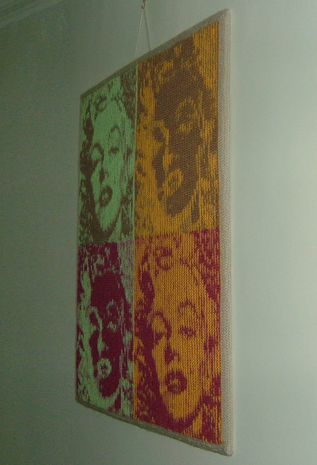
Andy Warhol's Marilyn Monroe screenprints, produced after her death in 1962. Warhol used a publicity still of Monroe and printed it in repeated grids with different color combinations, turning a human being into a mass-produced image.
Andy Warhol: The Factory and the End of Originality
Andy Warhol (1928-1987) was the figure who took Pop Art to its logical conclusion. He started as a commercial illustrator in New York, drawing shoes for fashion advertisements, and brought the techniques and sensibility of commercial art directly into fine art. His studio, known as The Factory, was run like a production line. Assistants produced silkscreen prints in series while Warhol supervised and selected. The name was deliberate. Warhol was not pretending to be a solitary genius in a garret. He was running an art manufacturing operation.
The Marilyn Monroe series (1962) used a single publicity photograph, printed in repeated grids with flat, unnatural color combinations: hot pink face, yellow hair, green eye shadow. The repetition was the point. Monroe was already a mass-produced image before Warhol touched her. Her face existed on movie posters, magazine covers, and billboards. Warhol's contribution was to stop pretending that art was separate from that reality. He produced her image the way America produced her image: mechanically, repeatedly, as a commodity.
The Death and Disaster series (1962-1964) is Warhol at his most disturbing. He silkscreened newspaper photographs of car crashes, electric chairs, race riots, and suicides, repeating the same image across a canvas until the ink degraded and the image became ghostly. The repetition mirrors how news media processes tragedy: the first image shocks, the tenth image is background, the hundredth image is invisible. Warhol's statement about the relationship between mass media and human suffering is as relevant now as it was in 1962. As the Tate's artist page on Warhol notes, his work exposes the numbing effect of repeated exposure to violent imagery.
Roy Lichtenstein: Comic Strips as Painting
Roy Lichtenstein (1923-1997) took a different approach to the same territory. Where Warhol used photography and silkscreen, Lichtenstein used painting to reproduce the look of commercial comic book printing. His most famous works, like "Whaam!" (1963) and "Drowning Girl" (1963), are large oil paintings that look exactly like enlarged panels from romance or war comics. The Ben-Day dots, the speech bubbles, the melodramatic captions: all hand-painted, all meticulously reproducing the visual language of cheap commercial printing.
"Whaam!" is based on a panel from a 1962 DC comic book, "All-American Men of War." Lichtenstein enlarged it to 172.7 by 406.4 centimeters and painted it in oil and acrylic. The result is a painting that looks like a comic but is the size of a history painting. The scale forces you to take it as seriously as a work by Rubens or Delacroix, while the subject matter is a fighter jet destroying another plane. The disjunction between the grand scale and the trivial source material is where the work operates. According to the Tate's page on "Whaam!", Lichtenstein wanted to make paintings that looked as though they had been made by a machine, and the tension between that intention and the actual hand-painting is part of what makes the work compelling.
Other Major Pop Artists
Claes Oldenburg made enormous soft sculptures of everyday objects: a giant hamburger, a floor lamp, a toilet, a slice of cake. The objects are familiar but their scale and material make them strange. A vinyl hamburger six feet across is simultaneously funny and unsettling. Oldenburg's work asks why we take the scale of consumer products for granted and what happens when that scale is disrupted.
James Rosenquist came from a background painting billboards, and his paintings use the visual language of outdoor advertising: fragmented images, abrupt juxtapositions, enormous scale. "F-111" (1965), 86 feet long, intercuts an image of a military jet with a little girl under a hairdryer, a tire, a mushroom cloud, and a plate of spaghetti. The painting wraps around the gallery walls, surrounding the viewer the way advertising surrounds a person walking through a city.
Tom Wesselmann focused on the female nude as mediated by consumer culture. His "Great American Nude" series presents women as flat, idealized forms surrounded by consumer products, reducing both to the same visual status. The work is deliberately uncomfortable in its equation of women with commodities, and that discomfort is the point.
David Hockney is often grouped with Pop Art, though his work is more varied. His early paintings of Los Angeles swimming pools, like "A Bigger Splash" (1967), treat the suburban pool as a subject worthy of serious painting, finding in its geometry and light a distinctly American form of beauty. Hockney's work is less about the critique of consumerism than about finding genuine visual interest in the ordinary.
The Techniques That Defined Pop Art
Pop artists used commercial and industrial techniques that had previously been excluded from fine art: silkscreen printing, Ben-Day dot reproduction, airbrush, and mechanical projection. Warhol's silkscreens were produced using the same process used for printing T-shirts and product packaging. Lichtenstein's Ben-Day dots were hand-painted simulations of the mechanical halftone printing used in newspapers and comics. The choice of technique was itself a statement: these artists rejected the idea that fine art required traditional manual craft.
The use of existing imagery rather than original composition was equally significant. Warhol did not design the Campbell's Soup label. Lichtenstein did not draw the comic panels. They selected, reproduced, and reframed. This practice raised questions about authorship and originality that are still being debated. In 2026, with AI-generated imagery raising the same questions about authorship and selection, Pop Art's approach feels remarkably prescient.
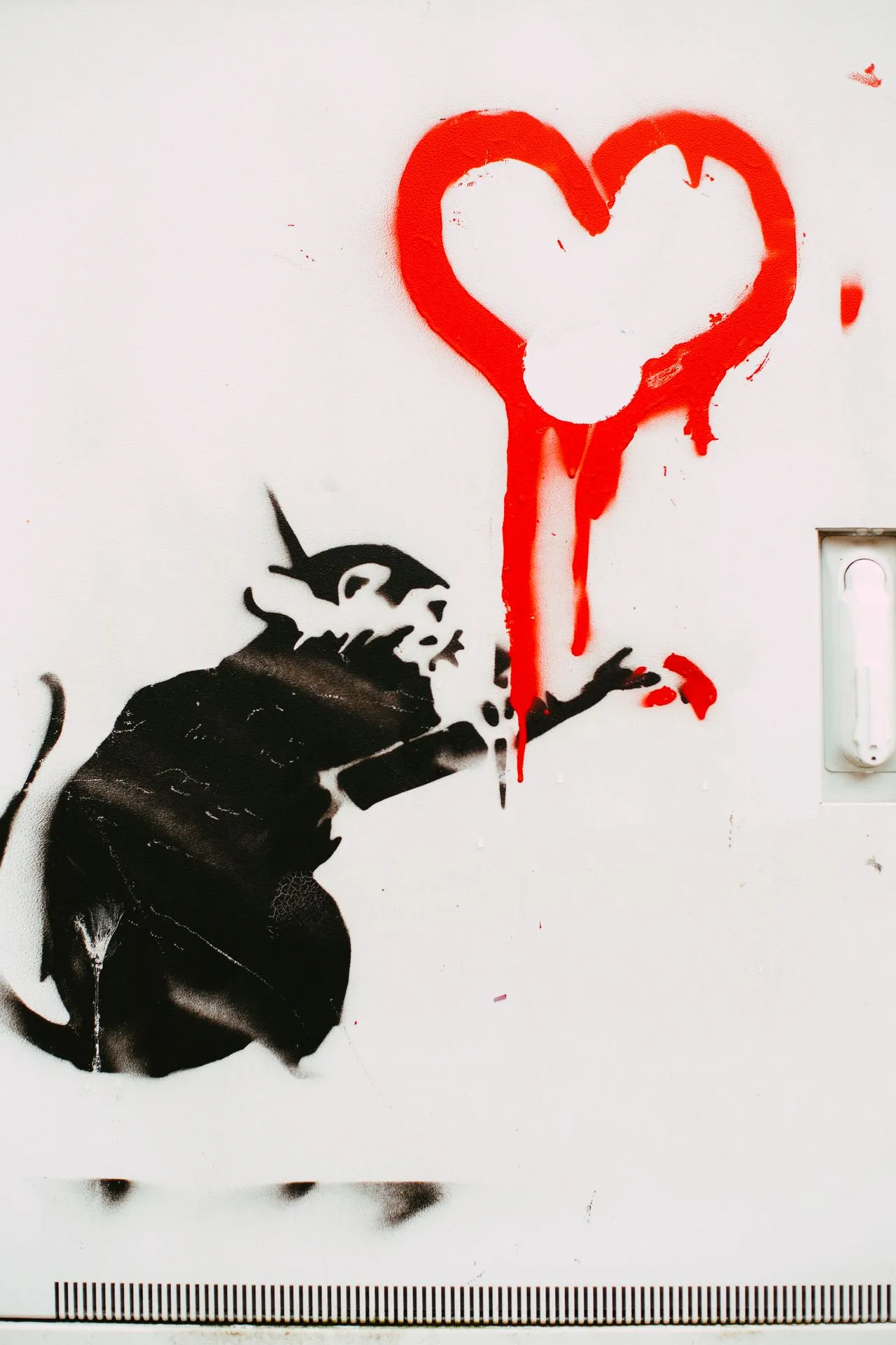
Photo by Markus Spiske on Pexels.com
Pop Art's Legacy in 2026
Pop Art's influence extends far beyond the 1960s. The movement normalized the use of commercial imagery in fine art, opened galleries to work made with industrial techniques, and established that the source of an image does not determine whether it can be art. Contemporary artists like Jeff Koons, Takashi Murakami, and KAWS work directly in the territory Pop Art opened: consumer objects at gallery scale, commercial imagery treated with fine art seriousness, the boundary between art and merchandise deliberately blurred.
Street art and graphic design owe Pop Art a direct debt. Shepard Fairey's "Hope" poster for Barack Obama's 2008 campaign used the same silkscreen aesthetic and the same strategy of turning a photograph into a graphic icon that Warhol pioneered. Album cover design, from Peter Saville's work for Factory Records to contemporary music packaging, operates in the same space between commercial design and fine art that Pop Art claimed.
The questions Pop Art raised about originality, reproduction, and the relationship between art and commerce are more relevant in 2026 than they were in 1962. When an AI generates an image from a text prompt, who is the author? When a digital artwork can be copied infinitely at zero cost, what does originality mean? Pop Art was asking these questions sixty years ago using soup cans and silkscreens. The technology has changed. The questions have not.
Final Thoughts
Pop Art was not just paint on canvas. It took the ordinary visual material of postwar consumer culture and placed it in galleries where only religious scenes, aristocratic portraits, and abstract masterpieces had previously hung. That single gesture changed what counted as art. It made the question of what belongs in a gallery into an open question, and it has stayed open ever since.
The movement's legacy is everywhere: in how contemporary artists use commercial imagery, in how design and fine art borrow from each other, in how we think about the relationship between mass media and artistic expression. Pop Art showed that the boundary between high culture and popular culture is not natural or permanent. It is a decision that can be questioned, crossed, and dissolved. Explore more about how art movements challenge boundaries in our guides to printmaking and screen printing and recognizing art styles. For how Pop Art fits into the broader story of modern art, see the evolution of art styles from Realism to Contemporary.


