
Stand in front of Mark Rothko's "No. 61 (Rust and Blue)" at the Museum of Contemporary Art in Los Angeles and most people stop talking. Not because they feel they should be quiet in a museum, but because something happens physiologically. The large rectangle of deep blue and rust red, roughly 9 feet tall, creates a pressure that viewers describe as immersive, unsettling, or close to grief. Rothko himself said he wanted his paintings to produce the same emotional intensity as Greek tragedy. He was not being dramatic. He understood how visual elements bypass rational thought and land directly in the body.
Art communicates emotion the same way a minor chord does in music: not through a message spelled out, but through the physical properties of the medium itself. Painters do not illustrate feelings. They engineer them using color, line, scale, texture, light, and composition. Understanding how that works does not diminish the emotional experience. It deepens it, because you begin to see the choices behind what you feel.
In this guide, you will learn the specific visual mechanisms artists use to generate emotional responses, the neuroscience research that explains why these mechanisms work, and how to read those choices in paintings you encounter.
Color: The Most Direct Emotional Channel

Left: "Twilight in the Wilderness" by Frederic Edwin Church (1860), Right: "Scenery in the Grand Tetons" by Albert Bierstadt (1865-1869)
Color works on emotion faster than any other visual element because it is processed in the brain before conscious recognition of form. A 2025 systematic review published in Psychonomic Bulletin and Review, covering 128 years of research across 42,266 participants from 64 countries, found that color-emotion correspondences are consistent and cross-cultural. Red is reliably associated with high-arousal states: love, anger, urgency, power. Blue and green correlate with lower-arousal positive emotions: calm, safety, reflection. Black maps to negative, low-arousal states. Grey to boredom and desolation.
These are not arbitrary conventions. The correspondences appear to be rooted in evolutionary associations: red signals blood and fire (threat and warmth simultaneously), blue signals sky and water (open space, safety), grey signals overcast weather and reduced visibility (danger, uncertainty). Artists exploit these deep associations deliberately.
Warm Colors in Practice
Frederic Edwin Church's "Twilight in the Wilderness" (1860) fills nearly the entire canvas with orange and red sky. The color is not just atmospheric description. Church was painting at the beginning of the American Civil War and the painting's fiery sky reads as prophecy, dread, and terrible beauty at once. The warmth that orange normally carries is overwhelmed by its saturation and its scale. When a color takes up the whole visual field, its emotional charge multiplies.
Cool Colors and Psychological Space
The opposite effect is visible in James McNeill Whistler's "Nocturne in Blue and Gold: Old Battersea Bridge" (c. 1872-1875). The near-monochromatic blue palette quiets everything. The bridge becomes a silhouette, the figures almost invisible, the fireworks distant sparks. Whistler wanted the painting to function like music: atmospheric, mood-inducing, without specific narrative content. The blue does most of that work without a single descriptive element.
Color Saturation and Emotional Intensity
Saturation is as important as hue. High saturation creates urgency and intensity; desaturated color creates distance or melancholy. Edvard Munch understood this: in "The Scream" (1893), the swirling orange and red sky is saturated to the point of visual aggression, while the figure in the foreground is reduced to near-grey. The contrast between the saturated background and the drained figure creates the painting's central emotional argument: the world is overwhelming; the self is hollowed out by it.
Line and Shape: The Body's Response to Direction
Diagonal lines produce a different physiological response than horizontal ones, and artists have used this for centuries. Horizontal lines feel stable because they echo the horizon and the resting body. Vertical lines feel aspirational or imposing, like architecture or standing figures. Diagonals imply movement, instability, and energy because the eye has to work to follow them.
In El Greco's "The Burial of the Count of Orgaz" (1586), the upper half of the painting is all diagonals and upward-reaching forms as the Count's soul ascends. The lower half, depicting the earthly mourners, uses more contained vertical and horizontal arrangements. The contrast between the two registers is not just compositional organization. It is an emotional argument about the difference between the earthly and the divine.
Curved lines carry different information. In Botticelli's "The Birth of Venus" (c. 1484-1486), the curving lines of Venus's body, the waves, and the windblown figures all generate a sense of grace and gentle movement. Angular shapes would produce a completely different emotional register. The curves are part of the painting's argument about beauty, which Botticelli understood as inherently graceful rather than dramatic.
Scale: How Size Creates Feeling
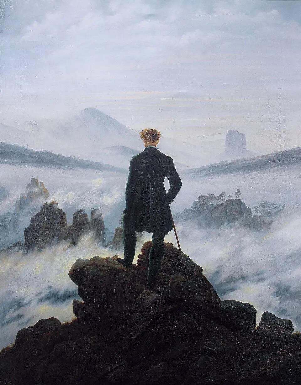
Caspar David Friedrich, "Wanderer above the Sea of Fog" (1818).
Scale is one of the most misunderstood tools in emotional painting. It is not just about the physical size of the canvas. It is about the relationship between figures and the world they inhabit. In Caspar David Friedrich's "Wanderer above the Sea of Fog" (c. 1818), the human figure is placed at the center of the composition but occupies only a small fraction of the canvas. Mountains, clouds, and endless sky fill the rest. The figure is not diminished by this. He is made more contemplative. Friedrich is using scale to say something about human consciousness in the face of nature: we are small, but we are the ones who stand here and look.
Contrast this with the Baroque tradition of large-scale religious and history paintings, where figures fill the canvas from edge to edge. Rubens and Caravaggio placed figures so close to the picture plane that they seem about to push through it. The scale creates urgency and physical presence. The viewer is not given the psychological distance that Friedrich provides. They are implicated, pulled into the scene.
Light and Shadow: Caravaggio's Emotional Architecture
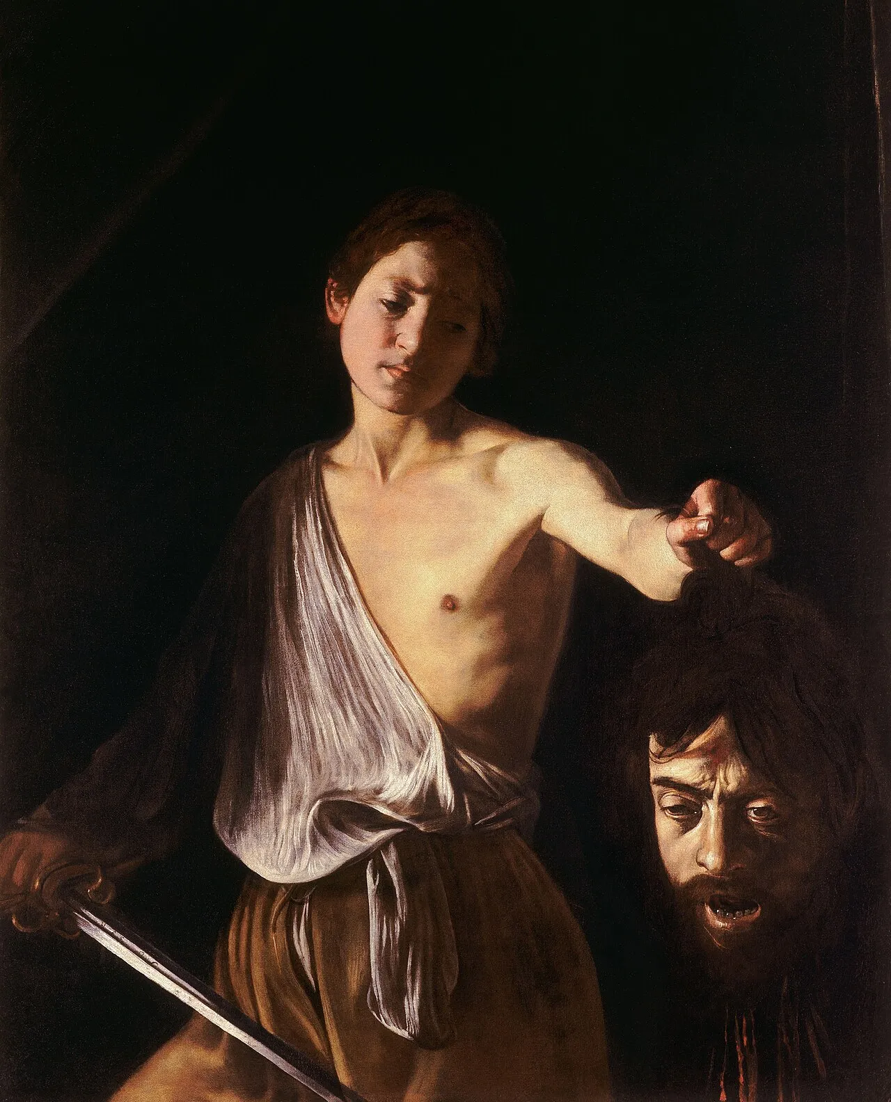
David with the Head of Goliath, Caravaggio, c. 1610. Galleria Borghese, Rome.
Chiaroscuro, the technique of using strong contrasts between light and shadow, is one of the most reliable ways to produce dramatic emotional impact in painting. Caravaggio took it further than anyone before him, eliminating mid-tones almost entirely and pulling figures from absolute darkness into concentrated light. The result is that his figures seem to exist in a state of extreme psychological exposure.
In "David with the Head of Goliath" (c. 1610), the painting is largely darkness. David's face catches light from an unknown source. Goliath's severed head, widely understood to be a self-portrait by Caravaggio, is half in shadow. The emotional content of the painting (guilt, triumph, horror, self-knowledge) is carried entirely by the quality and direction of the light. The darkness does as much work as the figures themselves. It creates the sense that something terrible has just occurred and is being examined in the only available light.
Even diffused, gentle light carries emotional information. Vermeer's interiors use even, cool light from a left-hand window to create a sense of absorbed, private existence. The figures in his paintings are always illuminated as if they do not know they are being watched. The light creates intimacy, a feeling of looking in at something genuine and unperformed.
Texture: The Emotional Content of Surface

Photo by Marina Leonova on Pexels.com
Texture in painting works through a kind of haptic empathy: the viewer's nervous system responds to described surface as though it were being touched. Thick impasto paint, where the pigment is applied so heavily it creates physical ridges on the canvas, produces a sense of energy, urgency, or even violence depending on the context. Van Gogh's late paintings use impasto so aggressively that the paint seems to be moving. The emotional turbulence in "The Starry Night" (1889) is inseparable from the physical activity of the paint surface. Smooth, flat paint would produce a completely different emotional result from the same composition.
Polished, smooth surfaces carry the opposite emotional weight. Academic painters of the 19th century prized the elimination of visible brushwork, producing surfaces that looked almost photographic. The emotional effect is cooler, more distanced, more idealized. The viewer is given no evidence of the physical act of making. This is emotionally appropriate for the idealized subjects these painters favored: the rough touch of impasto would undermine the illusion of divine perfection.
Composition: Where Things Sit and What That Means
Composition is the arrangement of everything in the picture, and it controls the viewer's emotional experience of the space as completely as the floor plan of a building. A crowded composition, where figures and objects push against each other and against the edges of the frame, generates tension and claustrophobia. A sparse composition with deliberate empty areas generates contemplative space.
The placement of a focal point within the picture affects emotional tone directly. Central placement, symmetrical and stable, produces calm or authority. Off-center placement produces tension and dynamism. Munch placed the screaming figure in "The Scream" not at the center of the canvas but slightly off it, on a bridge whose railings recede into the distance at an angle. The spatial instability of the composition mirrors the figure's psychological state. You cannot look at that painting and feel settled.
Research published in the journal Frontiers in Human Neuroscience (2025), using fNIRS and eye-tracking to measure how viewers respond to landscape paintings, found that color and compositional arrangement significantly influence neural activation in the prefrontal cortex regions associated with aesthetic emotion and decision-making. Viewers spent longer looking at and showed greater neural engagement with images where color and composition worked together to create visual complexity. This is experimental confirmation of what skilled painters have known intuitively for centuries: composition is not neutral. It steers the emotional response from the first moment of visual contact.
How to Read Emotional Content When You Visit a Gallery
The most useful habit to develop when standing in front of a painting is to separate the emotional response from the subject matter. A painting of a peaceful meadow can feel anxious if the color is wrong and the composition is unstable. A painting of a battle can feel strangely calm if the palette is cool and the composition is controlled. Subject and emotional content are not the same thing.
Start with color. Note your immediate response before you have consciously processed what you are looking at. Is the palette warm or cool? Saturated or muted? Then look at the lines and how they move your eye through the composition. Then at the light: where is it coming from, and what is it illuminating? Finally, consider scale: how large are the figures relative to the space they inhabit, and how does that make you feel about them?
By the time you have run through those four questions, you will have a much more specific account of your emotional response to the painting and, more importantly, you will understand why you feel what you feel. That is not a clinical reduction of the experience. It is a deeper access to what the painter actually did.
Final Thoughts
Art communicates emotion without words because it works directly on the perceptual and nervous systems, bypassing the language centers that normally mediate experience. Color, line, scale, light, and composition are not decorative choices. They are the primary means by which a painter conveys emotional content, and the most skilled painters use all of them in concert, each element reinforcing the others.
Understanding this does not make art feel less powerful. It makes the experience more precise. When you know that Rothko's blue is not just a color choice but a calculated act of emotional pressure, you are closer to what he was actually trying to do, not further from it.
For more on the specific visual tools behind what you see in paintings, read our guide to composition in art and our introduction to color theory for art appreciation. And if you want to practice putting emotional responses into words, the guide to critiquing art without sounding pretentious gives you a practical framework for doing exactly that.


