
In 2012, the Museum of Modern Art in New York acquired 14 video games for its permanent collection, including Pac-Man, Portal, and SimCity. Paola Antonelli, the curator behind the decision, called interaction design the defining design discipline of the early 21st century. The acquisitions were controversial. They are now, more than a decade later, largely uncontroversial among anyone who has paid attention to what game art direction has achieved since.
The question of whether video games "count as art" is no longer interesting. The more useful questions are: what visual problems are game designers solving that painters and filmmakers do not face, and which games have solved those problems with genuine distinction? Those are the questions this guide addresses.
What Makes Game Art Direction a Distinct Visual Problem
A game's visual world has to do something no painting or film set has to do: it must hold up under player control. A film director composes every frame. A painter controls every mark. A game art director creates a visual environment that players will see from angles, distances, and lighting conditions the artists cannot fully predict. The world has to be internally consistent and coherent from directions no single designer ever specifically intended.
This transforms composition from a fixed arrangement of elements on a picture plane into what designers call environmental storytelling: the arrangement of objects, architecture, light sources, and visual landmarks in three-dimensional space so that players intuitively understand where to go, what is dangerous, what is important, and what the world's history is, without being told any of it explicitly. A well-designed game environment communicates through spatial grammar the way a good painting communicates through compositional grammar.
FromSoftware, the Japanese studio behind Dark Souls, Bloodborne, and Elden Ring, has developed this capacity more consistently than any other studio working today. Their environments contain more implied history than players can fully absorb in a single playthrough: ruins that suggest a civilization that preceded the game's events, architecture whose current decay tells a story about what destroyed it. The environments are not backdrops for the action. They are the primary storytelling medium.
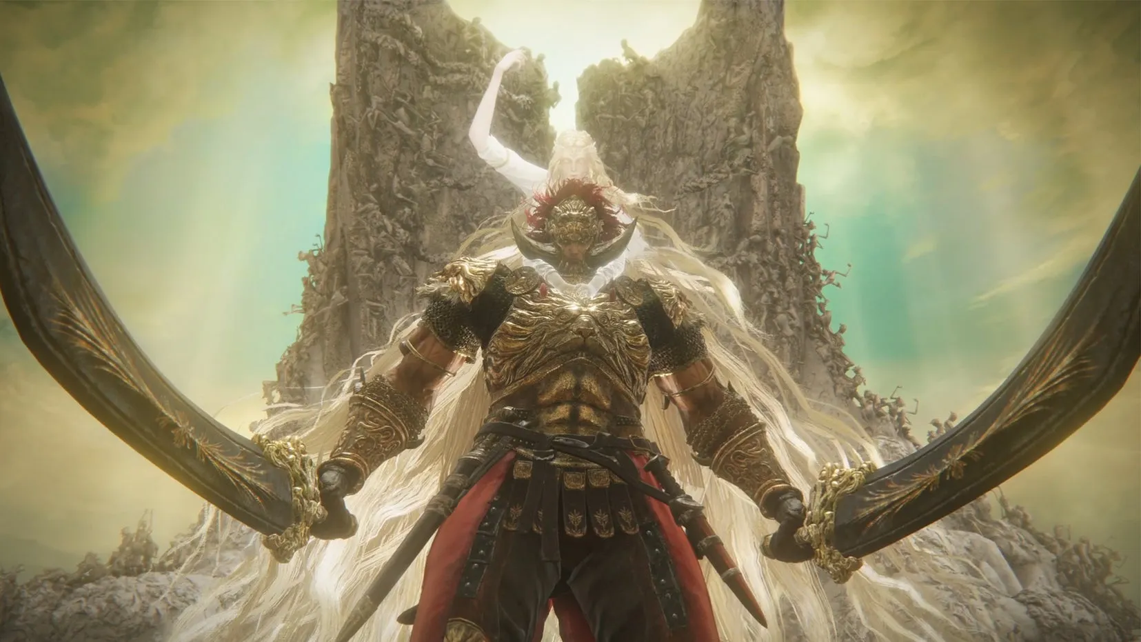
A screenshot from Elden Ring: Shadow of the Erdtree (2024). Image credit: Rock Paper Shotgun / Bandai Namco
Elden Ring and Color as Environmental Grammar
Elden Ring (2022) and its 2024 expansion Shadow of the Erdtree draw on Gothic and Romanesque architecture, Norse and Celtic mythological imagery, and Japanese aesthetic concepts about negative space. The visual references are layered rather than explicit: players encounter them as environmental experience and, if paying attention, begin asking questions about what they are seeing and what it implies.
Shadow of the Erdtree's design process involved specific decisions documented at CEDEC, Japan's major game development conference, by 3D artists Hidenori Sato and Reiji Katahira. The team faced a constraint common to large productions: memory and labor limits required reusing environmental assets across different locations. The visual problem was preventing players from feeling they were in the same place twice. The solution was systematic color theory. The same stone architecture, under sepia-toned desaturated light, reads as the Gravesite Plains. Under warm yellow light with black vertical line elements, it reads as the Shadow Keep. Identical assets, entirely different sense of place.
The Cerulean Coast required a different approach. The team wanted a specific sense of visual incongruity that procedural flower placement could not create. They manually positioned every flower in both foreground and background. That level of labor on a single area, in a game containing dozens of comparable areas, reflects a commitment to specific visual effect over production efficiency. The Elden Ring Official Art Book Volume III, published by Udon Entertainment in March 2026, documents the concept designs that preceded these decisions.
Journey and the Aesthetic of Reduction
thatgamecompany's Journey (2012) took the opposite approach. The visual world is built almost entirely from two colors, sand gold and sky blue, in an environment of desert dunes and ancient ruins. Design director Jenova Chen wanted to communicate the emotional arc of a human life, from birth through struggle to death and transcendence, using only imagery and music, with no language or explicit narrative. Every visual choice was evaluated against that emotional intention.
The result references the landscape tradition of Song dynasty Chinese painting directly and deliberately: small human figures against vast, simply organized natural spaces, with the relationship between the figure and the environment carrying the emotional weight. Chen studied art history, and the Song tradition, with its emphasis on negative space and human smallness against indifferent natural scale, was a conscious design reference. Journey won six BAFTA awards and entered the permanent collection of the Smithsonian American Art Museum. Its visual achievement is recognized across both game design and fine art contexts because the visual problem it solved, creating emotional arc through environmental design alone, was genuinely novel.
How Art History Feeds Game Visual Language
Game art directors study the same art history as painters and designers. The influence runs in specific, traceable directions.
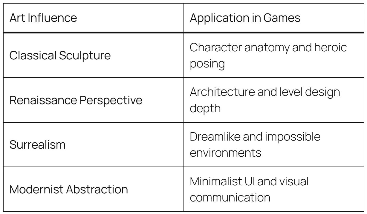
Art movements and their influence on game visual design. The connections between art history and game aesthetics are direct and often documented by the designers themselves.
The cel-shaded style of games like The Legend of Zelda: The Wind Waker (2002) and Borderlands (2009) references Japanese animation and woodblock print aesthetics: bold outlines, flat color fills, strong value contrast without photorealistic shading. The painterly environments of games like Gris (2018) draw on watercolor illustration traditions. The architectural environments of Bloodborne (2015) reference Victorian Gothic and H.R. Giger's biomechanical imagery so explicitly that critics documented the references in detail at release. The pixel art revival of the 2010s was partly a deliberate aesthetic choice by designers who grew up on early Nintendo games and now had the freedom to choose constraint as a visual language rather than having it imposed by hardware limits.
This is not aesthetic borrowing in a casual sense. Game art directors reference specific movements and periods with the same intentionality that architects reference historical styles. When asked about Elden Ring's visual influences, Hidetaka Miyazaki described drawing on imagery from "ruins that predate the society you can see," creating a layered archaeological visual language. That is a specific art historical methodology applied to environmental design.
The Concept Art Pipeline
Understanding how game visual worlds are produced changes how you evaluate them. In a standard production pipeline, concept artists establish the visual language of the game before any three-dimensional assets are built. They produce paintings and drawings that define architectural styles, character designs, color palettes, and lighting moods. These are design specifications: every visual element in the final game should trace back to a concept image that a director approved.
This process is closer to architecture than to fine art in one key respect: the concept art is a plan for a built environment, not an end in itself. The artists who make it are solving design problems, not creating autonomous works. But the intelligence required to solve those problems, understanding how light creates mood, how architectural scale communicates power or vulnerability, how color relationships create emotional tone, is the same intelligence that produces great paintings. The medium is different. The visual thinking is not.
The concept art for major games is increasingly treated as collectible and archival material. Dark Horse's Art of Elden Ring books document rejected character designs and architectural concepts that never made it into the final game. These function like the preparatory drawings for a major building: they reveal the thinking behind decisions that the finished work embeds but does not explain.
Shadow of the Colossus and the Visual Problem of Scale
Fumito Ueda's Shadow of the Colossus (2005, remade 2018) solved one specific visual problem with unusual precision: how do you make a creature feel genuinely enormous rather than just large? The game's sixteen giant creatures, the colossi, need to feel like geological rather than biological scale. Encountering one should feel like encountering a cliff face, not a large animal.
Ueda's approach worked on three levels. First, movement: the colossi move with the slow inertia of genuinely massive structures, because their physical size makes rapid movement physically implausible. Second, texture: their surfaces reference geological and architectural materials, fur that reads like grass, stone that reads like ancient construction, organic forms that suggest evolutionary history measured in geological time. Third, environmental framing: the world around the colossi is designed so that scale comparisons are constantly available and always reinforce the creatures' enormity. The result is that encounters feel like confrontations with landscape, not with enemies. That is a precise visual achievement, produced by deliberate artistic decision-making, and it is as sophisticated as comparable achievements in any other visual medium.
What Interactive Media Added to Visual Art
The most significant contribution of video games to visual art is player agency over time spent in a visual environment. A visitor to the Louvre spends an average of 15 seconds looking at the Mona Lisa. A player in a carefully designed game environment might spend hours in a single location, approaching from different directions, at different points in the game's lighting cycle, with different emotional histories from recent gameplay affecting how they process what they see. The visual environment accumulates meaning through extended, embodied, self-directed experience in a way no fixed image can achieve.
This created a genuinely new aesthetic category: environments designed not to be looked at but to be inhabited. The artistic challenge is not producing a beautiful image but producing a beautiful spatial experience that stays coherent and meaningful across hours of exploration from directions and distances the artists never specifically composed. Some game designers have solved that problem with real intelligence. Those solutions belong in any serious account of 21st-century visual art.
For the broader history of digital visual creativity, see our guide to Digital Art: The Modern Creative Frontier Explained. For the art history movements that feed game aesthetics most directly, the Complete Guide to Art Movements provides the reference context. Which game do you consider a genuine work of visual art? Share your answer in the comments.


