
Every December, a color company in New Jersey tells the world what color to like next year. In December 2025, Pantone announced that the 2026 Color of the Year would be PANTONE 11-4201 Cloud Dancer, "a lofty white that serves as a symbol of calming influence in a society rediscovering the value of quiet reflection." The announcement was covered by CNN, the New York Times, Vogue, and hundreds of design blogs. Within weeks, Cloud Dancer appeared in product lines from Post-it Notes to Play-Doh to itel wireless earbuds. The Color of the Year is not a poll, a vote, or a democratic process. It is a decision made by a small team at the Pantone Color Institute, based on trend analysis across fashion, entertainment, technology, and global events. The selection is not "the most popular color." It is "the color that Pantone's analysts determine best captures the cultural moment." A color company, in other words, is telling you how to feel, and you are complying.
Pantone was founded in 1956 as a commercial printing company in New Jersey. In 1963, Lawrence Herbert, an employee who had been hired to mix ink, created the Pantone Matching System (PMS), a standardized color system that allowed printers in different locations to reproduce the same color. PMS became the global standard for color communication. In 2000, Pantone launched the Color of the Year, a marketing initiative that has become one of the most influential design trends in the world. This guide covers the history of Pantone, the Pantone Matching System, every Color of the Year from 2000 to 2026, how the selection process works, the influence of the Color of the Year on design and fashion, and the critique of why a color company should not be telling you how to feel.

Pantone logo. Pantone Inc., Carlstadt, NJ. Image via Wikimedia Commons.
Pantone: From Printing Company to Color Authority
Pantone was founded in 1956 in Moonachie, New Jersey, as a commercial printing company. The company originally produced color charts for cosmetics companies. Lawrence Herbert was hired to mix ink. Herbert realized that the problem of color reproduction was not a printing problem but a communication problem. Printers, designers, and clients had no common language for color. "This red" could mean ten different things to ten different people.
In 1963, Herbert created the Pantone Matching System, a system of 500 standardized colors, each with a unique number. A designer could specify "PMS 185" and a printer anywhere in the world could reproduce that exact color. PMS was not a pigment system. It was a communication system. It solved the problem of color ambiguity by assigning a number to each color. PMS became the global standard for color in printing, packaging, fashion, and product design. Pantone expanded to over 10,000 colors across multiple systems, including Solid, Coated, Uncoated, Pastel, Metallic, and Neon. Herbert acquired the company in 1962 and sold it to Danaher Corporation in 2007 for $180 million. Pantone is now owned by Danaher.
Pantone color chips and guide. The Pantone Matching System (PMS) standardizes color across printing, design, and manufacturing. Photo by Dbenbenn, via Wikimedia Commons, CC BY-SA 3.0.
Pantone's achievement was not the creation of new colors but the standardization of existing ones. By assigning numbers to colors, Pantone made color communicable. A designer in New York could specify a color and a factory in Shenzhen could reproduce it. This was a revolution in manufacturing, not in art. But it also had a cultural effect: it made color a commodity, something that could be owned, specified, and sold. For the broader context, see our color theory guide.
The Color of the Year: Every Selection from 2000 to 2026
Here is the complete chronological list of every Pantone Color of the Year from 2000 to 2026, with the color name, number, and a one-sentence description of the cultural context.
- 2000: PANTONE 15-4020 Cerulean, "the color of the sky on a clear day," reflecting optimism at the turn of the millennium.
- 2001: PANTONE 17-2031 Fuchsia Rose.
- 2002: PANTONE 19-1664 True Red, post-9/11, a color of patriotism and resilience.
- 2003: PANTONE 14-4811 Aqua Sky.
- 2004: PANTONE 15-5217 Tigerlily.
- 2005: PANTONE 15-5217 Blue Turquoise.
- 2006: PANTONE 13-1107 Sand Dollar.
- 2007: PANTONE 19-1557 Chili Pepper.
- 2008: PANTONE 18-3943 Blue Iris.
- 2009: PANTONE 14-0848 Mimosa, "a warm, engaging yellow" during the financial crisis.
- 2010: PANTONE 15-5519 Turquoise.
- 2011: PANTONE 18-2120 Honeysuckle, "a brave, confident color" for a recovering economy.
- 2012: PANTONE 17-1463 Tangerine Tango.
- 2013: PANTONE 17-5641 Emerald.
- 2014: PANTONE 15-3919 Radiant Orchid.
- 2015: PANTONE 18-3224 Marsala.
- 2016: PANTONE 13-1520 Rose Quartz and PANTONE 15-3919 Serenity, the first dual selection, reflecting gender fluidity.
- 2017: PANTONE 15-0343 Greenery, "a fresh and zesty yellow-green" reflecting environmental awareness.
- 2018: PANTONE 18-3838 Ultra Violet, "a dramatically provocative and thoughtful purple shade."
- 2019: PANTONE 16-1546 Living Coral, "an animated, life-affirming coral hue."
- 2020: PANTONE 19-4052 Classic Blue, "a reassuring and confident blue" during COVID-19.
- 2021: PANTONE 17-5104 Ultimate Gray and PANTONE 13-0647 Illuminating, a dual selection for resilience and optimism.
- 2022: PANTONE 17-3938 Very Peri, "a dynamic periwinkle blue hue with a vivifying violet-red undertone."
- 2023: PANTONE 18-1750 Viva Magenta, "an unconventional shade for an unconventional time."
- 2024: PANTONE 13-1023 Peach Fuzz, "a velvety gentle peach tone."
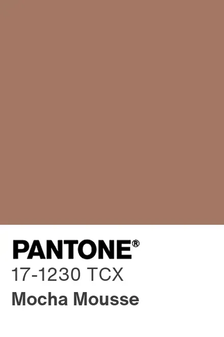
- 2025: PANTONE 18-1662 Mocha Mousse, "a warming, brown hue."
- 2026: PANTONE 11-4201 Cloud Dancer, "a lofty white that serves as a symbol of calming influence."
The pattern is clear. The colors reflect the cultural moment: 2002 True Red after 9/11, 2009 Mimosa during the financial crisis, 2016 Rose Quartz and Serenity for gender fluidity, 2017 Greenery for environmentalism, 2020 Classic Blue during COVID-19. The Color of the Year is a barometer of cultural mood, or at least of what Pantone thinks the cultural mood is or should be. It lines up with the wider shifts we track in contemporary art trends for 2026.
How the Selection Works
The Pantone Color Institute, a consulting division within Pantone, makes the selection. The team is led by Leatrice Eiseman, executive director, who has been involved in the Color of the Year since its inception in 2000. The team conducts trend analysis across multiple categories: fashion (runway shows, street style), entertainment (films, streaming series, music), technology (product design, UI), art (gallery exhibitions, art fairs), travel (destination trends), sports (Olympic colors, team uniforms), and global events (political movements, economic conditions, environmental crises).
The final choice is not the most popular color. It is "the color that Pantone's analysts determine best captures the cultural moment: the collective emotional state, the aspirational mood, and the directional shift that defines the period." The selection is made in a private meeting. There is no public vote, no transparency, and no published criteria. The Color of the Year is an editorial decision, not a democratic one. The announcement is made in early December, timed to influence the following year's design cycles, fashion collections, product launches, and interior design trends. The December announcement gives manufacturers and designers time to incorporate the color into their lines.
The Color of the Year is a self-fulfilling prophecy. Pantone announces a color, manufacturers adopt it, the color appears in products, consumers see it, and the color becomes popular, confirming Pantone's prediction. The "trend" is not discovered by Pantone. It is created by Pantone. The Color of the Year is not a forecast but a marketing campaign, and one of the most successful marketing campaigns in design history. This is the same mechanism of authority-by-declaration we examine in our piece on art and society.
The Influence: From Fashion to Play-Doh
The Color of the Year influences runway collections, fast fashion, and textile manufacturing. Designers incorporate the color into their lines, sometimes because they genuinely like it, sometimes because retailers demand it. The color appears in stores within months of the announcement. The Color of the Year also appears in consumer products: phones, cars, appliances, furniture. In 2026, Cloud Dancer appeared in Post-it Notes, Play-Doh, and itel wireless earbuds as part of Pantone's official brand partnerships.
The Color of the Year influences paint companies, wallpaper manufacturers, and furniture designers. Pantone licenses the Color of the Year to paint companies like Benjamin Moore and Sherwin-Williams, who create matching paint colors. On social media, the Color of the Year generates thousands of Instagram posts, Pinterest boards, and design blog articles. The announcement is a media event, covered by CNN, the New York Times, Vogue, and hundreds of other outlets. The Color of the Year is not just a color. It is a content generator.
The Color of the Year is the most successful color marketing campaign in history. It demonstrates the power of a single organization to shape global design trends. It also demonstrates the willingness of designers, manufacturers, and consumers to be told what to like, to accept a color not because they chose it but because an authority selected it.
The Critique: Why a Color Company Should Not Tell You How to Feel
The Color of the Year is presented as a cultural diagnosis, "the color that best captures the cultural moment." But the cultural moment is not a single thing. There is no single color that captures the mood of 8 billion people. The Color of the Year is a generalization, and a generalization made by a small team in New Jersey, based on their own biases, preferences, and commercial interests.
Pantone licenses the Color of the Year to manufacturers. Every product that uses the Color of the Year pays Pantone for the privilege. The Color of the Year is not just a cultural diagnosis. It is a revenue stream. The more influential the Color of the Year becomes, the more money Pantone makes. There is a conflict of interest: Pantone has a financial incentive to select colors that will be commercially successful, not colors that are culturally accurate. The Color of the Year also homogenizes design. When every manufacturer adopts the same color, the result is a monoculture, a world where every product, every store, every Instagram post features the same color. The Color of the Year reduces the diversity of color in design. It replaces individual choice with corporate direction.
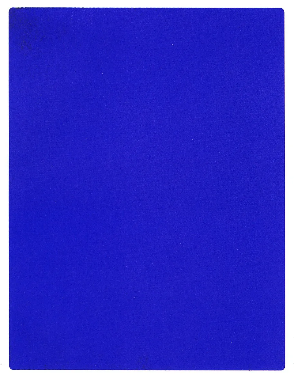
Yves Klein, "IKB 191" (1962). Pure pigment and synthetic resin on canvas. Klein tried to own a color the way Pantone sells one. Image via Wikimedia Commons.
The alternative is to remember that color is not a trend. Color is a material, a history, a culture, and a personal choice. The history of color in art, from lapis lazuli to cochineal to Vantablack, is a history of diversity, not uniformity. The Color of the Year is the opposite of this history. It is a single color, selected by a single organization, imposed on a global market. The alternative is to choose your own colors, to understand where they come from, what they mean, and why you like them. This is the same question of who gets to declare meaning that we take up in the institutional theory of art.
Cloud Dancer (2026): A White for Quiet Reflection
PANTONE 11-4201 Cloud Dancer is a soft, warm white. Pantone describes it as "a lofty white whose aerated presence acts as a whisper of calm in a noisy world" and "a billowy white imbued with serenity" that "encourages true relaxation and focus, allowing the mind to wander and creativity to breathe." The 2026 selection follows a trajectory of calming, escapist colors: 2024 Peach Fuzz, "a velvety gentle peach tone," and 2025 Mocha Mousse, "a warming, brown hue." Cloud Dancer is the logical next step, from warm brown to soft white, from comfort to emptiness. The language is telling: "quiet reflection," "calming influence," "measured consideration." This is the language of a society that is overwhelmed, by information, by politics, by technology, and that wants to be told to slow down. A color company is selling you the permission to rest.

Pantone Color of the Year announcement format. PANTONE 11-4201 Cloud Dancer was announced as the 2026 Color of the Year in December 2025. Image via Wikimedia Commons.
There is an irony here. Cloud Dancer is a white. White is the color of lead poisoning, thanks to lead white paint. It is the color of modernist exclusion, the white cube gallery. It is the color of colonial purity. It is the color of mourning in East Asia. The "calming" white that Pantone is selling has a history that is anything but calm. But Pantone does not deal in history. It deals in mood. The Color of the Year is not about what white means but about how white feels, and how it can be sold. Read our history of white for the full story, and our history of blue for how a single color became an institution.
Final Thoughts
Pantone's Color of the Year is the most influential color marketing campaign in design history. Since 2000, a small team at the Pantone Color Institute has selected a single color each year that "best captures the cultural moment." The selection is based on trend analysis across fashion, entertainment, technology, and global events, but it is a private, editorial decision, not a democratic process. The Color of the Year influences fashion, product design, interior design, and social media, generating millions of dollars in licensed products and media coverage. But it is also a self-fulfilling prophecy: Pantone announces a color, manufacturers adopt it, and the color becomes popular, confirming Pantone's "prediction." The 2026 Color of the Year, Cloud Dancer, is a soft white that "encourages true relaxation and focus," a color for a society that wants permission to slow down. The Color of the Year is not a cultural diagnosis but a commercial product, and one of the most successful ones in design history.
Next time you see the Color of the Year in a store, on a blog, or on social media, ask yourself: did you choose this color, or was it chosen for you? The Color of the Year is not a trend. It is a directive. The alternative is to choose your own colors, to learn where they come from, what they mean, and why you like them. Color is too important to be outsourced to a company in New Jersey. You can read the official Pantone Color of the Year 2026 page, the Pantone press release, and a full archive at House Beautiful's every Pantone Colour of the Year.


