
In 1930, the Chrysler Building in New York completed its stainless steel crown. The sunburst arches and eagle gargoyles at its upper levels drew on Aztec and Egyptian imagery filtered through the visual grammar of industrial machinery. It was simultaneously a skyscraper, a piece of sculpture, and a monument to the idea that modern life was worth celebrating in steel and chrome. It was also the defining image of a visual movement that had already spread from Paris across three continents in less than a decade.
Art Deco is the style most people recognize before they know what to call it: the stepped profiles of 1920s skyscrapers, the sleek curves of ocean liner interiors, the geometric poster typography of travel and transport advertising, the lacquered furniture and jade jewelry and Bakelite radios that furnished a particular kind of wealthy modern life between the two world wars. This guide traces where the style came from, what it actually looked like in practice, who the key artists and designers were, and why a century later it keeps returning in architecture, fashion, and graphic design.
Where Art Deco Came From
The name comes from the Exposition Internationale des Arts Decoratifs et Industriels Modernes, held in Paris in 1925. The exhibition was originally planned for 1915 but was postponed by the First World War, and when it finally opened it drew 16 million visitors over five months. Its purpose was to showcase modern decorative arts that were original rather than historicist: no reproductions of past styles, only new work. The result was a concentrated demonstration of a visual direction that had been developing across European design since at least 1910.
Art Deco's sources were multiple and not always consistent with each other. The geometric abstraction of Cubism contributed its fractured planes and rejection of organic naturalism. The Wiener Werkstatte, the Viennese design collective founded in 1903, contributed its commitment to luxury craft and geometric ornament. The discovery of Tutankhamun's tomb in 1922 triggered a wave of Egyptian imagery: lotus flowers, scarab beetles, hieroglyphic-style lettering, and the stepped pyramid profile that appears in dozens of skyscrapers and department stores built in the 1920s and 1930s. Aztec and Mayan imagery contributed similar stepped geometries. Ballets Russes costume and set designs by Leon Bakst, with their saturated colors and Eastern-influenced imagery, contributed the palette. The style was genuinely international from the beginning, synthesizing sources from four continents into something that felt entirely contemporary.
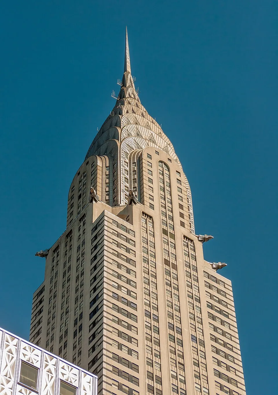
The Chrysler Building, New York City (completed 1930), architect William Van Alen. The stainless steel crown, with its sunburst arches and eagle gargoyles modeled on Chrysler hood ornaments, is one of the defining images of Art Deco architecture. Image: Public domain, via Wikimedia Commons
What Art Deco Actually Looks Like
Art Deco is primarily a style of surface and ornament rather than structure, which is why it translated so readily across different media. Its visual characteristics appear consistently from architecture to jewelry to book covers:
Geometric forms take precedence over organic ones. Chevrons, sunbursts, stepped ziggurat profiles, fan shapes, and stylized plant forms reduced to their geometric essence are the basic vocabulary. Symmetry is preferred, often bilateral, creating a formality that reads as luxury rather than severity. Colors are saturated and contrasting: black and gold, teal and ivory, deep red and chrome. Materials signal wealth: chrome and stainless steel, black lacquer, ivory and jade, shagreen (shark skin), exotic veneers, and semi-precious stones in jewelry.
Speed is a consistent subject. The streamlined forms of locomotives, ocean liners, and automobiles fed directly into Art Deco design vocabulary: curved surfaces that suggest motion, horizontal banding that implies velocity, aerodynamic profiles applied to objects that do not move at all, like refrigerators and radios. The style celebrated the machine age not by depicting machines but by borrowing their visual logic.
Key Artists and Designers
Tamara de Lempicka is the Art Deco painter most people know, partly because her self-portrait in a green Bugatti (1929) is one of the most perfectly composed images of the period. A Polish-born artist who worked in Paris after fleeing the Russian Revolution, she developed a figurative style that used the fractured planes of Cubism and the saturated color of the Fauves in service of a subject matter entirely her own: wealthy, confident, sexually self-possessed women. Her figures have a chrome-plated quality, smooth surfaces and precise outlines that make them feel simultaneously human and machine-manufactured. The MoMA collection holds several works from this period that document the visual crosscurrents she drew from.
Rene Lalique, who had made his reputation as an Art Nouveau jeweler in the 1890s and 1900s, transitioned into Art Deco glasswork in the 1920s, producing glass panels, vases, car mascots, and architectural installations using industrial molding techniques to create objects that combined mass production with aesthetic sophistication. His car mascots for Rolls-Royce and Citroen, stylized animals and female figures in frosted glass, were among the most visible Art Deco objects in daily life for anyone wealthy enough to own a quality automobile.
Architect William Van Alen's Chrysler Building and the Empire State Building by Shreve, Lamb and Harmon (1931) are the canonical Art Deco skyscrapers, but the style appears in hundreds of less famous buildings across New York, Miami, Los Angeles, and cities across Europe, Australia, and India. Miami's South Beach district has the largest concentration of surviving Art Deco architecture in the world, a result of the building boom that accompanied the city's 1920s and 1930s resort development. The Miami Design Preservation League has documented and worked to preserve this architecture since the 1970s.
Art Deco Across Media
The reach of Art Deco across different visual fields is worth tracing specifically, because it is unusual for a single style to translate so completely across architecture, fine art, graphic design, fashion, industrial design, and jewelry simultaneously.
In graphic design, the poster work of A.M. Cassandre established the visual language for transport advertising. His "Normandie" (1935), promoting the French ocean liner, uses a dramatically foreshortened view of the ship's bow rendered in flat geometric planes of navy and cream. It communicates speed, scale, and luxury without depicting any of them directly. The typography is bold sans-serif, the composition symmetrical, the color palette severe. It remains one of the most studied poster designs in the history of the medium.
In fashion, the 1920s flapper silhouette, the dropped waist, the straight line, the geometric embroidery, aligned Art Deco's visual logic with the social changes of the decade. Coco Chanel's use of jersey fabric and simple geometric cuts and Paul Poiret's more theatrical orientalist designs both drew on Art Deco vocabulary. The jewelry of Cartier and Van Cleef and Arpels from the 1920s, with its combinations of platinum, diamonds, sapphires, emeralds, and jade in geometric settings, represents some of the highest craft expression of the period.
In cinema, the sets of films including Fritz Lang's "Metropolis" (1927) and the Hollywood musicals of the 1930s directed by Busby Berkeley used Art Deco architecture and geometry as visual grammar. Berkeley's overhead kaleidoscope shots of chorus dancers moving in geometric formations are essentially Art Deco compositions set in motion.
Why Art Deco Keeps Coming Back
Art Deco has never entirely disappeared from visual culture. Its most direct 20th-century revival was in the 1980s, when postmodern architects including Michael Graves and Robert A.M. Stern returned to historical ornament after decades of Modernist austerity, and the stepped profiles and geometric ornament of Deco appeared in new commercial buildings, furniture, and product design. The revival was partly a reaction against the perceived coldness of International Style modernism and partly a response to 1980s wealth culture, which found in Art Deco's celebration of luxury a congenial visual register.
More recent revivals have been filtered through nostalgia and popular culture. The visual design of Baz Luhrmann's "The Great Gatsby" (2013) brought Art Deco imagery to a global audience, though at a level of excess that might have surprised the original designers. Contemporary graphic design and branding regularly draw on Art Deco typography and geometric motifs, particularly for products positioned as luxurious or timeless.
The deeper reason for its persistence is that Art Deco solved a specific design problem, how to make modern, machine-produced objects feel luxurious and significant, with a level of visual sophistication that later movements have not surpassed. The geometric ornament is rigorous enough to feel intelligent and rich enough to feel sensuous. The materials it preferred, chrome, lacquer, jade, stainless steel, remain associated with quality. The optimism about modern life that drove the style in the 1920s is not currently fashionable, but the visual language that optimism produced is hard to abandon entirely. For the broader context of 20th-century design movements, see our Complete Guide to Art Movements. To see how Art Deco fits within the broader history of design and architecture, our guide to The Bauhaus: The Design School That Changed Everything covers the contemporary movement that took the opposite approach to the same industrial moment.


