
Katsushika Hokusai was in his early seventies when he drew it. A massive wave, its claw-like foam fingers reaching toward three small fishing boats, with Mount Fuji reduced to a small white shape in the background. The image is "The Great Wave off Kanagawa" (c. 1831), and it has been reproduced more times than any other artwork in history. Yet most people who know the image have never thought much about the tradition it comes from, a visual culture stretching back fifteen centuries that is philosophically unlike anything in the Western canon.
Japanese art is not simply art made in Japan. It is a complete visual philosophy built around principles that are nearly opposite to those of Western academic painting. Where European painting from the Renaissance onward pursued illusions of depth, mass, and dramatic incident, Japanese art pursued economy, suggestion, and silence. Where Western painting filled the canvas, Japanese ink painting left most of it empty. This was not a limitation. It was the point. In Japanese aesthetics, empty space is not absence. It is an active element, charged with meaning.
This guide covers the major traditions of Japanese art, from the woodblock prints of the Edo period to the Zen ink painting tradition, and explains why the concept of ma, the aesthetic of empty space, is one of the most useful ideas any art viewer can encounter regardless of what tradition they are looking at.
Ukiyo-e: The Art of the Floating World
The word ukiyo-e translates roughly as "pictures of the floating world," and it names one of the most democratic art forms in history. Ukiyo-e woodblock prints emerged in the Edo period (1603 to 1868) as a popular art form sold in print shops for roughly the price of a bowl of noodles. They depicted the pleasures of city life: theater actors, sumo wrestlers, courtesans, famous landscapes, and scenes from classical literature. Unlike the painted screens that decorated aristocratic homes, ukiyo-e was made for everyone and priced accordingly.
The production process was collaborative. A painter created the design, a carver cut it into cherry wood blocks (one per color), and a printer applied pigment and pressed dampened paper against the block. For a full-color nishiki-e print, a separate block was required for each color, and the alignment between blocks had to be precise to within a fraction of a millimeter. The results were reproduced in editions of hundreds or thousands. These were not unique luxury objects. They were affordable, reproducible images for an urban population that wanted them.
Hokusai and the Thirty-six Views of Mount Fuji
Katsushika Hokusai (1760 to 1849) worked in every genre of ukiyo-e but is most celebrated for his series "Thirty-six Views of Mount Fuji" (1830 to 1833), which shows Fuji from different locations and in different seasons. "The Great Wave" is technically one of forty-six prints (ten were added after the initial thirty-six sold out), and its genius is compositional. The wave functions as a frame through which you see Fuji, and the diagonal sweep of the crest creates kinetic energy that feels almost cinematic even now. The foam at the wave's tips breaks into small curling shapes that echo Fuji's snowcap, creating a visual rhyme between water and mountain across the width of the composition. This kind of formal intelligence is not accident.
Hokusai was famously restless and self-critical. He changed his artist name more than thirty times over his career. He wrote that everything he had done before age seventy was worthless. He was still producing major work at ninety, and he reportedly died saying that if he had just five more years he could have become a real painter. That level of driven dissatisfaction with one's own achievement is worth noting when you look at the work.
Hiroshige and the Beauty of Transience
Utagawa Hiroshige (1797 to 1858) pursued a different quality: atmosphere. Where Hokusai was architectural and energetic, Hiroshige was lyrical and melancholy. His masterwork, "The Fifty-three Stations of the Tokaido" (1833 to 1834), depicted each stop along the famous road from Edo to Kyoto, capturing the specific light and weather of each place at a specific moment. Snow falls on travelers crossing a mountain pass. Rain streaks diagonally across a night scene. Mist erases the far shore of a lake completely.
Hiroshige understood that weather and season are not incidental to a landscape. They are the landscape. His prints do not show places so much as they show moments at those places. That is why they feel emotionally resonant even in reproduction, and it is why Vincent van Gogh copied two of them in oil paint, including "Sudden Rain over Ohashi Bridge," now in the Van Gogh Museum in Amsterdam.
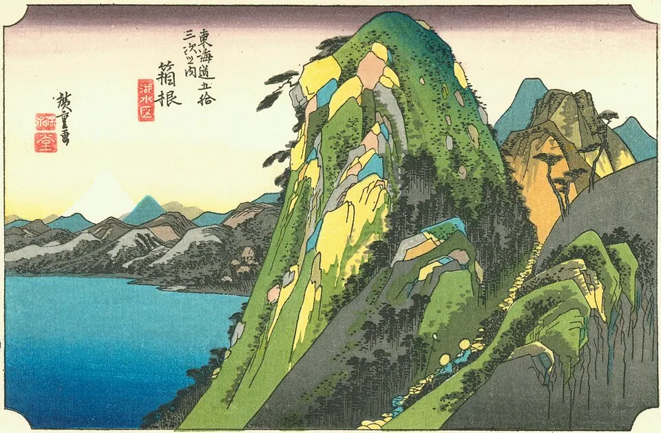
Utagawa Hiroshige, "Station 11: Hakone," from "The Fifty-three Stations of the Tokaido" (1833), color woodblock print. Hiroshige's atmospheric landscapes captured specific moments of light, weather, and season with extraordinary precision. Image: Public domain, via Wikimedia Commons
Japanese Ink Painting: Emptiness as Technique
Before woodblock prints became the dominant popular art form, Japanese painting had already developed a profound tradition rooted in Chinese practice but distinctly its own. Japanese ink painting, known as sumi-e (ink picture) or suibokuga (water-ink painting), uses a brush and black ink on paper or silk. Color is rare. Texture is minimal. What matters is the quality of the brushstroke: its energy, its spontaneity, its economy.
Sumi-e arrived in Japan from China via Zen Buddhism in the 13th and 14th centuries. Zen monks practiced ink painting not as decoration but as spiritual discipline. The ideal was a brushstroke that captured the essential nature of a thing in a single gesture, what Zen philosophy calls the thing's "suchness." This is why Zen ink paintings of bamboo, plum blossoms, and birds look so radically simple compared to Western painting from the same period. The painter was not describing the subject. They were attempting to transmit a direct understanding of it through the movement of the wrist. Whether you believe this is possible is almost beside the point. The quality of attention required to attempt it produces a different kind of painting.
Sesshu Toyo and the Haboku Technique
Sesshu Toyo (1420 to 1506) is the most celebrated Japanese ink painter, a monk and artist who traveled to China to study landscape painting at its source. He returned to Japan with a thorough command of both precise and loose ink techniques and pushed both further than any predecessor.
His most radical experiment was haboku, or "splashed ink." In his "Splashed Ink Landscape" (1495), now in the Tokyo National Museum, Sesshu applied ink in loose, almost violent washes that suggest mountains, water, and a pavilion without explicitly describing any of them. The image is complete not despite what is left out but because of it. You read the pale areas as mist, the dark areas as rock, the middle tones as atmospheric distance. Your eye and imagination complete the painting. This is a fundamentally different idea of what a painting does than anything in the Western tradition before the 20th century's Abstract Expressionism, and Sesshu arrived there in 1495.
Ma: The Aesthetic Power of Empty Space
To understand Japanese art, you need to understand ma. The word is usually translated as "negative space" or "interval," but neither translation captures it. Ma is not the gap between things. It is the active quality of that gap: its tension, its breathing room, its role in making everything around it more present.
You experience ma in a Hiroshige landscape when a huge area of mist separates two travelers on a road. The emptiness makes the figures lonelier, the road longer, the weather more enveloping. You experience it in a Zen ink painting when a single branch occupies the lower right corner of a large sheet of paper. The blankness above and to the left is not nothing. It is sky. It is distance. It makes the branch feel both small and essential, which is precisely the point.
Ma extends far beyond painting into every aspect of Japanese aesthetics. In architecture, it is the deliberate pause between spaces. In music, it is the silence between notes. In theater, it is the stillness before a dramatic movement. The tea ceremony is built almost entirely from ma: the considered intervals between actions, the silences between words, the empty spaces in the room that give the tea bowl, the scroll, and the flower arrangement their weight. A room that contained only art objects with no empty wall, no silent interval, would be suffocating. Ma is what lets each element breathe and be fully itself.
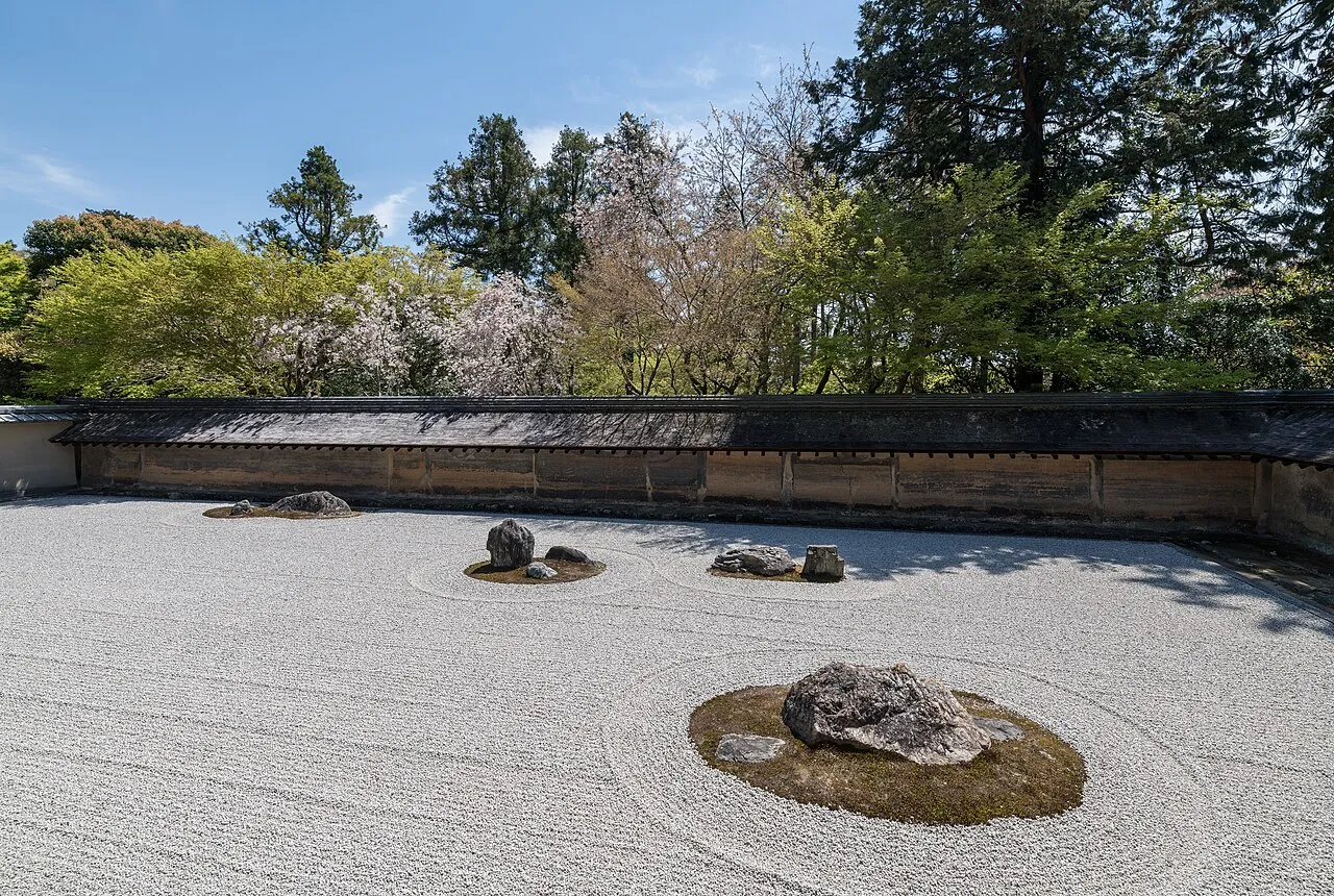
The rock garden at Ryoan-ji temple, Kyoto (late 15th century). Fifteen rocks are arranged in raked white gravel so that from any angle, one rock is always hidden. The garden is a masterclass in ma: the vast expanse of raked gravel is not empty but charged with spatial meaning. Image: Wikimedia Commons, CC BY-SA 4.0
Japonisme: How Japan Changed Western Art
When European collectors and artists first encountered Japanese woodblock prints in the 1850s and 1860s, the effect was immediate and disorienting. The prints violated almost every rule of Western academic painting. Perspective was flat. Color was unmodulated. Compositions were asymmetric, with important subjects pushed to the edge or even cut off by the frame. Shadows did not exist. And yet the prints were strikingly beautiful and emotionally powerful in ways that polished academic paintings were not.
Claude Monet began collecting ukiyo-e prints in the 1870s and eventually owned 231, which he hung throughout his home at Giverny. The influence on his work is visible in his use of flat color areas, absence of cast shadows, and above all his willingness to make water and sky the subjects of paintings rather than backdrops for narrative action. His later water lily paintings, with their dissolution of foreground and background into a single continuous surface, are essentially Japanese in their spatial logic. Monet may or may not have articulated it that way, but the connection is structural.
Van Gogh copied two Hiroshige prints in oil, including "Sudden Rain over Ohashi Bridge" and "Plum Park in Kameido," both now in the Van Gogh Museum in Amsterdam. He wrote to his brother Theo that Japanese art was "like a religion" for him. The bold black outlines, simplified flat color areas, and cropped asymmetric compositions that define his mature style owe a direct debt to ukiyo-e that Van Gogh himself acknowledged.
This phenomenon, known as Japonisme, shaped not just Impressionism but Art Nouveau, the Nabis movement, and much of early Modernism. The standard narrative of Western modern art as a purely European development omits how much of it was borrowed, consciously and enthusiastically, from Japan. The Metropolitan Museum's overview of Japonisme documents the specific borrowings in detail.
How to Look at Japanese Art
Japanese art rewards slow looking in ways that more immediately spectacular Western work often does not. When you encounter a Japanese painting or woodblock print, here are several things to pay attention to:
The quality of the brushwork: In ink paintings, pay attention to how a line is made, whether it was applied quickly or slowly, with pressure or without. The variations in ink intensity and line weight encode the painter's energy and decision-making.
The use of empty space: Ask yourself what the empty areas are doing. What do they suggest? What atmosphere, distance, or feeling does the blankness create?
Asymmetry and cropping: Japanese compositions rarely place the main subject in the center. Notice where things are positioned and how the frame interacts with the image, sometimes cutting off a figure or branch in ways that feel deliberate.
Seasonal and atmospheric details: Japanese art is highly season-conscious. Cherry blossoms signal spring, chrysanthemums signal autumn, snow signals winter. These are not decorative choices. They are philosophical ones about impermanence and time.
The best way to understand how to look at art from any tradition is to slow down and let the work show you its priorities rather than imposing your own expectations on it. Japanese art is particularly good at rewarding that patience.
Final Thoughts
Japanese art is one of the most coherent and philosophically ambitious visual traditions in the world. From Sesshu's splashed ink landscapes to Hokusai's kinetic waves to Hiroshige's atmospheric roads, it demonstrates that great art can be made not by filling space but by choosing what to leave empty. The concept of ma, the charged interval and the active pause, is one of the most transferable ideas in all of art history. Once you understand it in a Japanese context, you start seeing it everywhere: in the silence before a musical phrase, in the white margin around a poem, in the empty wall space between paintings in a gallery. The interval is doing work. It was always doing work.
For context on how Japanese prints changed Western painting specifically, our guide to Impressionism picks up that thread. For a broader look at how different world art traditions approach the question of space and emptiness, our guide to Islamic geometric art shows a tradition that approaches pattern and meaning from a completely different angle. What aspect of Japanese art surprises you most? Share your thoughts in the comments.

