
Every painter who has been at it for a while has had the same frustrating experience at the start: you mix a color you can clearly see in your head, and what comes out is either too warm, too gray, or simply unrecognizable. You add more of one pigment to fix it, then more of another, and within a few minutes you have a muddy gray-brown that nobody asked for. This is not a failure of eye or hand. It is a failure of information. Color mixing is predictable once you understand why it behaves the way it does.
The single most important piece of information most art teachers skip: mixing paint and mixing light are completely different processes that follow opposite rules. Once you understand why they are different, and once you know the three properties that determine how any two paints will combine, you can reach any color you want through a logical sequence of decisions rather than trial and error.
This guide covers the mechanics of subtractive mixing, the three properties of color you need to track simultaneously, the split primary palette that professional painters use to keep mixes clean, and specific approaches to the colors that defeat beginners most often: darks, greens, flesh tones, and purples.
Why Paint Mixing Is Not Like Mixing Light
Your phone screen creates color by emitting red, green, and blue light simultaneously. Mix all three channels at full intensity and you get white. This is additive mixing: combining light wavelengths produces progressively lighter results.
Paint works by the opposite principle. A tube of cadmium red absorbs most of the light spectrum and reflects mainly red wavelengths back to your eye. When you mix two paints, you combine their absorbing tendencies. The resulting mixture absorbs what each individual pigment absorbs and reflects only the wavelengths that both pigments agree to pass through. Add a third pigment, and the mixture absorbs even more of the spectrum. This is subtractive mixing: the more pigments you combine, the more light is absorbed, and the darker and grayer the result becomes.
This is why mixing many paint colors together tends toward gray-brown. Each pigment contributes its own absorption pattern, and the combined mixture ends up absorbing most of the visible spectrum. The practical rule is to use as few pigments per mixture as possible. Two pigments produce cleaner, more saturated results than three. Three produce cleaner results than four. According to color theory research summarized by the Inter-Society Color Council, the maximum gamut achievable in subtractive mixing shrinks measurably with each additional colorant introduced.
The Three Properties You Have to Track at Once
Every color has three independent properties. Beginners typically track one (hue) and ignore the other two, which is why mixes go wrong even when the hue seems correct.
Hue
Hue is the color's name: red, yellow, blue, orange, green, violet. It is what most people mean when they say "color." Two paints can share a hue name and behave completely differently in mixtures, because hue alone does not tell you enough about how the pigment will interact with others.
Value
Value is how light or dark the color is. Yellow at full saturation is inherently much lighter than violet. Cadmium red is lighter than alizarin crimson. When you are mixing for a specific tone, value must be matched alongside hue. A color that is the right hue but the wrong value will look wrong in context regardless of how precisely you matched the name.
Temperature
Temperature is the warm-to-cool direction within any hue. Not all reds are the same temperature. Cadmium red leans warm, toward orange. Quinacridone red leans cool, toward blue-violet. This is the property that matters most for avoiding muddy mixtures. A warm red mixed with ultramarine (which is also warm, leaning toward violet-red) produces a dirty brownish purple, because the warm red carries a yellow undertone and you are effectively mixing all three primaries at once. A cool red like quinacridone mixed with ultramarine produces a clean violet, because neither pigment carries a yellow bias. You can read more about how these temperature relationships work visually in our broader guide to color theory for art appreciation.

Johannes Itten's color wheel from "The Art of Color" (1961). Complementary pairs sit directly opposite each other. When mixed together in paint, complementaries neutralize each other toward gray rather than producing a secondary color. Image: Public domain, via Wikimedia Commons
The Split Primary Palette
Elementary school teaches red, yellow, and blue as the three primaries that can mix any color. The problem is that this system treats each primary as single and neutral, which no real pigment is. Every paint leans toward one of its neighboring primaries on the color wheel. A more accurate and useful approach is the split primary palette: two versions of each primary, one warm and one cool.
A full split primary palette contains six colors:
Warm red: Cadmium red medium (leans toward orange)
Cool red: Quinacridone red or alizarin crimson (leans toward violet)
Warm yellow: Cadmium yellow medium or hansa yellow deep (leans toward orange)
Cool yellow: Lemon yellow or hansa yellow light (leans toward green)
Warm blue: Ultramarine blue (leans toward violet)
Cool blue: Phthalo blue or cerulean blue (leans toward green)
With these six plus white, you can mix clean secondaries by pairing the two primaries that share no third-primary bias. Clean green: cool yellow plus cool blue, both lean away from red. Clean violet: cool red plus warm blue, both lean away from yellow. Clean orange: warm red plus warm yellow, both lean away from blue. Muddy mixes happen when you accidentally bring a third primary into the combination. The split system makes this visible and avoidable.
Mixing Darks Without Going Gray
Most beginners reach for black to darken a mixture, and this is almost always the wrong move. Black is a cold, dense pigment that deadens every color it touches. Add it to a warm red and you get a dull burgundy-gray. Add it to yellow and you get an olive-green that may not be what you wanted at all.
Rembrandt understood this. His approach, which drew on the Venetian painting tradition, was to build dark passages from complementary color relationships rather than black. Adding a small amount of the complementary to a mixture reduces its saturation without killing its warmth or temperature. A little green into a red darkens it while keeping the temperature complex. A little violet into an orange pushes it toward shadow while retaining a sense of light.
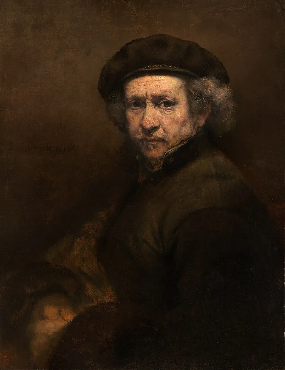
Rembrandt van Rijn, "Self-Portrait" (c. 1665), oil on canvas, 114.3 x 94 cm. Kenwood House, London. The warm richness of the darks here comes from complementary-based mixing rather than black. The shadows retain color temperature and depth that black would have destroyed. Image: Public domain, via Wikimedia Commons
For the deepest near-blacks, professional painters often use mixtures of transparent dark pigments: alizarin crimson, phthalo green, and phthalo blue combined in varying proportions. These three are all inherently dark and transparent, and they produce a range of near-blacks with real color temperature: lean toward the phthalo green for a cooler dark, toward the alizarin for a warmer one. The result reads as a true dark rather than a hole in the painting.
The Colors That Trip Up Beginners Most Often
Flesh Tones
Human skin sits across a very wide value and temperature range, but most skin tones contain some combination of warm red-orange, yellow-ochre, and white, with cooler colors introduced in shadow areas. The Impressionists painted skin shadows with blue-violet and lavender because shadows outdoors are lit by sky rather than sun, making them genuinely cooler than lit areas. That observation, not convention, drives the color choice.
A practical starting point for lighter skin tones is cadmium red plus cadmium yellow plus a large proportion of white, adjusted toward pink or peach. For darker skin tones, burnt sienna, raw umber, and yellow ochre are better starting pigments than attempting to darken a pink mixture. The darker the base, the more the earth pigments carry the weight. For any skin tone, introduce the complement in small amounts to build the shadows: a touch of viridian green for a warm flesh, a touch of ultramarine for a cooler one.
Vivid Greens
Phthalo green straight from the tube is too synthetic and acidic for most naturalistic painting. Landscape greens work best from cool yellow (lemon yellow or hansa yellow light) mixed with a small amount of cool blue (cerulean or phthalo blue), adjusting the ratio to move between yellow-green and blue-green. Adding a small touch of red-violet neutralizes the green slightly and moves it toward the naturalistic range without killing the vibrancy. Test this mixture at different ratios and you have the full spectrum of believable foliage colors.
Clean Purples
As the temperature section above explains, the only reliable route to a clean purple is quinacridone red (cool) mixed with ultramarine blue (warm but leaning violet). Adding white produces lavenders. For deeper purples, dioxazine purple is a single-pigment paint that achieves purity no mixture can match. It is also extremely potent: a small amount goes a long way, and it can overwhelm other colors if added carelessly.
Building the Habit
Color mixing improves through accumulated practice more than through any amount of study. Keep a mixing journal: mix each combination on a scrap of paper, label what you used, and let it dry before evaluating it. Wet paint is always slightly different in value and saturation from dry paint, and building a reference library of how your specific pigments actually behave accelerates learning faster than any other single practice.
For understanding how these mixing principles connect to how artists have historically used color on canvas, our guide to color theory for art appreciation covers the perceptual and historical side. For applying these principles in specific media, see our guides to acrylic painting and watercolor technique. What mixing problem have you been stuck on? Share it in the comments and we will try to help you work through it.


