Color and Light: The Physics of Painting, Explained for Working Artists
The most influential modern practitioner-author on colour for representational painting is James Gurney, whose book "Color and Light: A Guide for the Realist Painter" (2010) reframed Munsell, simultaneous contrast, and atmospheric perspective for working painters. But Gurney's blog, Gurney Journey, covers a broad range of topics beyond colour science. For artists who want a resource focused specifically on the physics of light and its application to painting, Color and Light fills that gap.
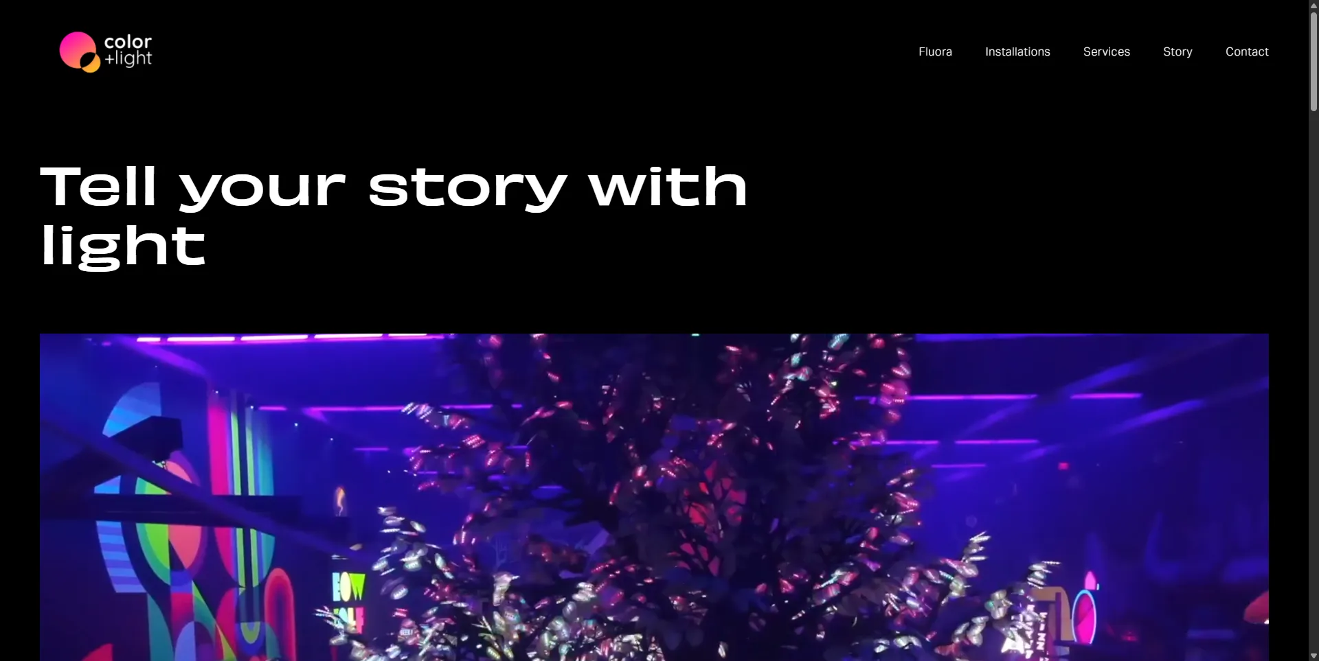
Founded in 2020 and based in Oakland, California, Color and Light is a small, independent operation run by co-founders Aaron Oppenheimer and Jake Lampack. According to SignalHire data, the company has 1-10 employees and an estimated annual revenue of $1-10 million. The site is niche, but its content is rigorous and grounded in actual physics rather than the simplified colour wheels that dominate most art education.
Why a Science-Based Approach Matters
Most colour theory resources for artists rely on simplified models and rules of thumb that do not accurately reflect the actual physics of light and colour. The standard colour wheel, for instance, is a useful tool for understanding basic colour relationships, but it does not explain why the sky is blue, why shadows on snow look blue, or why skin under warm light has cool shadows. These phenomena require an understanding of the physics of light scattering, surface reflection, and human visual perception.
Color and Light grounds its instruction in the specific scientific principles that govern how light and colour actually work. Articles cover the physics of blackbody radiation and how different light sources produce different colour temperatures, the optics of simultaneous contrast and how adjacent colours affect each other's perceived hue and value, and the biology of colour constancy and how the brain compensates for changes in lighting conditions.
Insider tip: If you are serious about understanding colour, read Gurney's "Color and Light" book first. It provides the foundational vocabulary. Then use the Color and Light blog to go deeper into specific phenomena. The two resources complement each other rather than competing.
Colour Theory Content
The colour theory articles are the core of the blog. They cover colour temperature, saturation, and value interactions with a depth and rigour that is genuinely unusual in art education resources.
The colour temperature articles are among the most practically useful, covering the specific physics of blackbody radiation and how understanding these physics can inform more accurate and expressive colour decisions. The content is grounded in the specific physics of how different light sources produce different colour temperatures, providing a scientific foundation for the colour decisions that painters make every day.
The simultaneous contrast articles address the optical phenomenon in which adjacent colours affect each other's perceived colour and value. Understanding this is essential for painters who want to understand why specific colour combinations produce unexpected visual effects, and the blog's coverage is among the most accessible available.
The colour constancy articles address how the brain compensates for changes in lighting conditions to maintain a consistent perception of object colours. This is particularly valuable for painters who work from observation and want to understand why their colour perception can be unreliable in certain conditions.
Insider tip: Colour constancy is the reason your painting looks correct under your studio lights but wrong under gallery lights. If you exhibit your work, paint under lighting conditions that match the exhibition space as closely as possible. The blog's articles on colour constancy explain why this matters and how to manage it.
Light Physics and Optical Phenomena
The light physics content covers the specific physical properties of light that affect its behaviour in painting subjects. Articles address how light reflects from different types of surfaces (diffuse reflection from matte surfaces versus specular reflection from shiny surfaces), the physics of atmospheric scattering that produces atmospheric perspective, and the optical properties of different materials.
The atmospheric scattering articles are grounded in the specific physics of Rayleigh scattering and Mie scattering, explaining why distant mountains appear cooler and less saturated than near foliage. As a May 2026 article on colour theory for composition noted, atmospheric perspective is the most reliable depth cue in landscape painting and the one most consistently violated by beginners, who paint distant mountains in foreground saturation and lose the spatial reading.
The subsurface scattering articles are particularly valuable for portrait painters. Subsurface scattering is the optical phenomenon in which light penetrates the surface of translucent materials like skin and scatters beneath the surface before emerging. Understanding this is essential for painters who want to represent the specific quality of light in skin convincingly.
The iridescence articles cover thin-film interference, the physics that produces iridescent effects in feathers, butterfly wings, and other natural objects. This content is particularly valuable for natural history illustrators.
Practical Application
The practical application content bridges the gap between scientific principles and the specific challenges of applying them in painting. The colour mixing articles are particularly useful, covering the differences between additive and subtractive colour mixing, how different pigments behave when mixed, and approaches to achieving accurate colour mixing in different painting media.
A February 2026 post by Alain J Picard demonstrated the practical application of these principles: painting the same subject under warm and cool light sources and showing how the entire palette shifts. The subject did not change. The light did. That is the kind of demonstration that makes the abstract physics of colour temperature immediately useful to a working painter.
Competitor Comparison
Color and Light is a niche resource, and its closest comparison is Gurney Journey, which covers colour science as part of a broader range of painting topics. Gurney Journey has the advantage of eighteen years of accumulated content and the authority of James Gurney's name. Color and Light has the advantage of focus: every article is specifically about colour and light physics, without the plein air painting reports, art history analyses, and other topics that fill Gurney Journey.
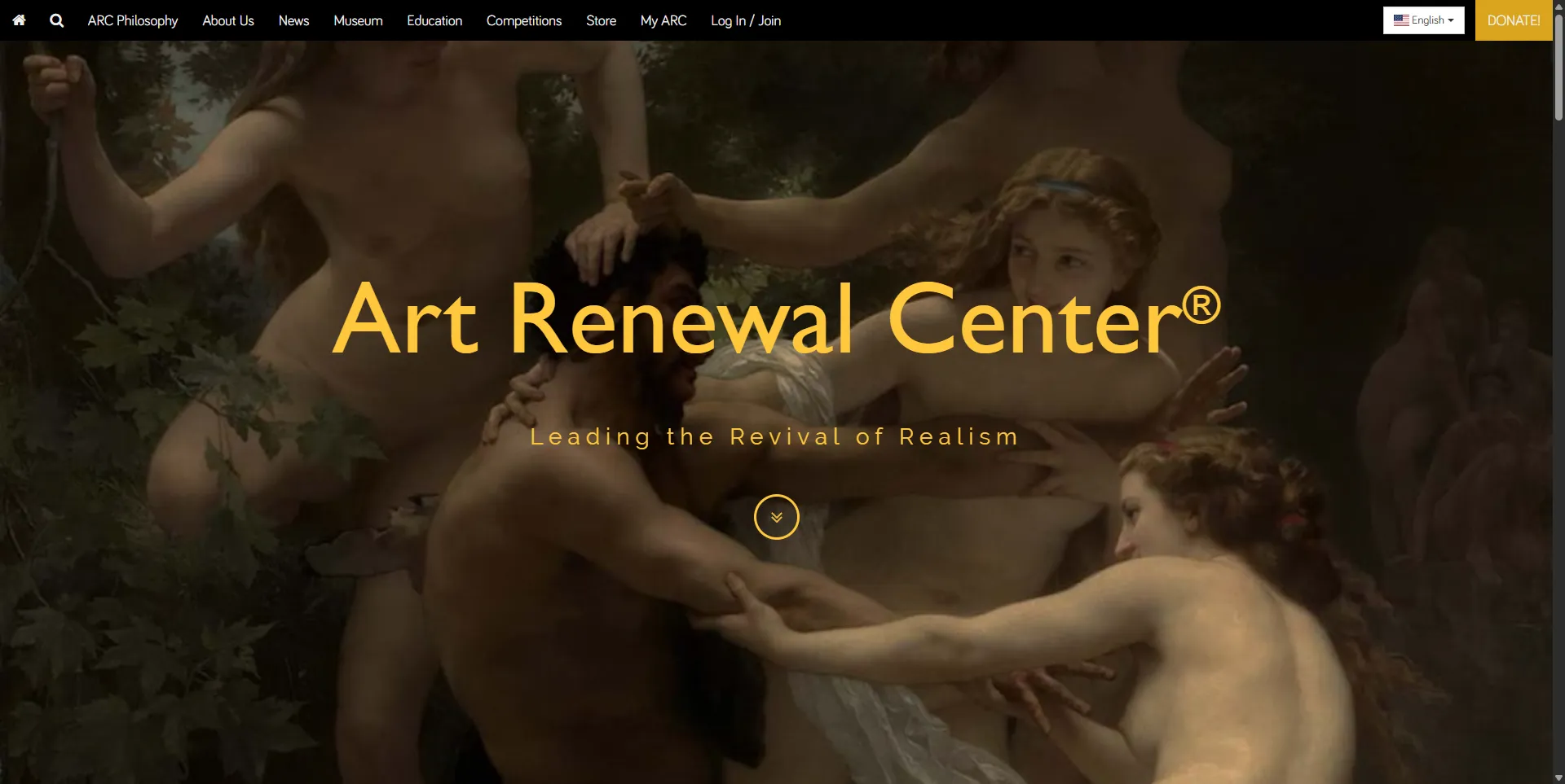
For artists who want a broader colour education resource, Artists Network offers colour theory tutorials as part of its wider traditional media painting content. The Art Renewal Center provides historical context for academic painting techniques but does not focus on colour science specifically.
The Limitations
The site is small. Traffic data suggests a modest readership, with monthly visits in the low hundreds as of mid-2026. The publishing frequency is not high, and the content depth varies between articles. Some posts are thorough explorations of specific phenomena; others are shorter and less developed. The site design is functional but not polished, and the navigation could be improved to help readers find specific topics within the archive.
The small team and limited resources mean that the blog cannot match the output frequency or breadth of larger art education platforms. But for the specific niche it occupies, the quality of the scientific content is strong.
Final Verdict: Who Is This Actually For?
Color and Light is for painters who want to understand the physics behind what they see. If you have ever wondered why shadows on snow look blue, why your colour mixing produces unexpected results, or why your painting looks different under gallery lights than under your studio lights, this blog provides the scientific answers. It is a specialised resource for artists who are intellectually curious about the physics of their craft.
It is not for artists looking for step-by-step painting tutorials, technique demonstrations, or broad art education. The content is focused specifically on colour and light science, and if that is not your interest, the blog will feel narrow.
Visit colorandlight.art to explore the archive. For related resources, see our profiles on Gurney Journey, Artists Network, and the Art Renewal Center.